Editing a chart gadget
Chart gadgets display data from BIRT data objects in Adobe Flash based charts.
Dashboard designers can customize chart gadget options using the Chart Builder—General options. For more information about general options, see Setting general gadget options, earlier in this section.
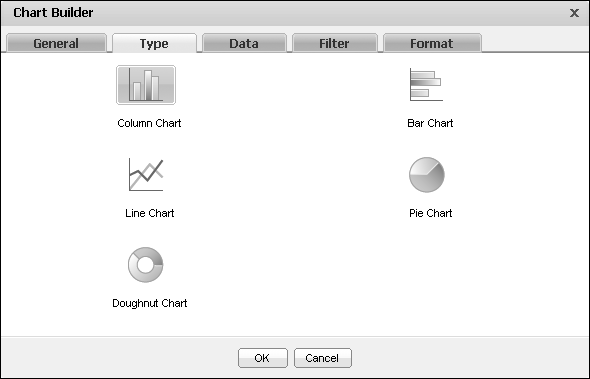
When adding or editing a chart gadget, you can change the chart type displayed in the gadget, as shown in Figure 4-19.
Assigning data to chart gadgets
Adding a chart gadget to a dashboard or editing it, displays Chart Builder—Data, where the developer selects data to display in the chart. Chart gadgets can display data from any data set or cube in a single data object file.
Dashboard designers can also limit the data that appears in the gadget by using Chart Builder—Filter to create filter conditions. For more information about filtering, see Filtering data source in gadgets, earlier in this section.
If hyperlinks exist in the data object file, they can appear in the chart by selecting Chart Builder—Data—Use default hyperlink.
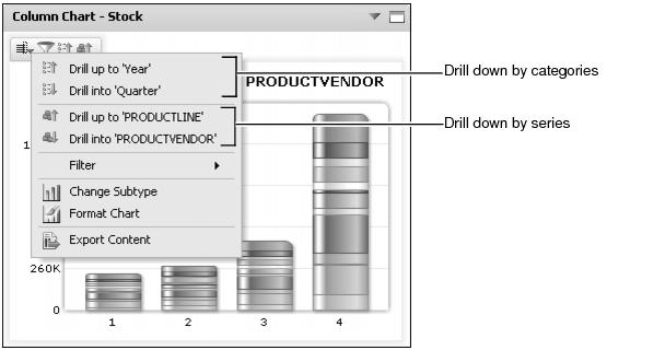
Chart gadgets that display data cubes support automatic drill-through, allowing users to drill-through category and series data in the same chart. For example, a chart showing stock by year and country supports drill-down to look at the time category in greater detail such as quarters or months. After finding the right time view, the user can then drill-down to a more detailed location view like city.
Tooltips can appear in a chart gadget and display the following information:
|
n
|
The dashboard designer assigns the data to the different parts of the chart. Each chart type presents data differently.
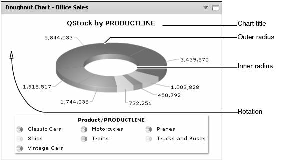
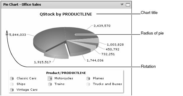
Pie and doughnut chart gadgets can slice and group data categories, like names of countries or product types, as shown in Figure 4-20. Values define the size of each slice relative to the other slices.
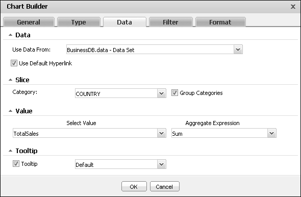
When the category data is a date, an additional option for selecting the time interval appears. Bar, column, and line chart gadgets can display and group data categories, like names of countries or product types, as shown in Figure 4-21.
Dashboard designers can use aggregate expressions to summarize data set values. Table 4-2 shows the aggregate expressions available in chart gadgets Chart gadgets can group category data received from a data set. Data from a cube is already aggregated and grouped. Chart gadgets support drill-through of categories and series for data from a cube. Drill-through by series requires Group Legend Items be set to a dimension in the cube.
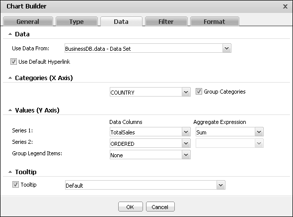
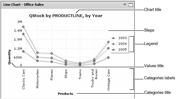
For example, a user viewing a chart of sales data can use drill-down to view sales in all months of a specific quarter when time is set as a category. When the Group legend items is set to product line, the user can drill-through to look at specific product vendors and products while still viewing the data for the selected time. Figure 4-22 shows an example of this type of drill-through.
Formatting a bar chart
You can format a bar chart gadget to modify its appearance on a dashboard. Figure 4-23 shows the elements that you can modify.
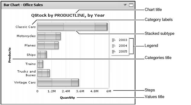
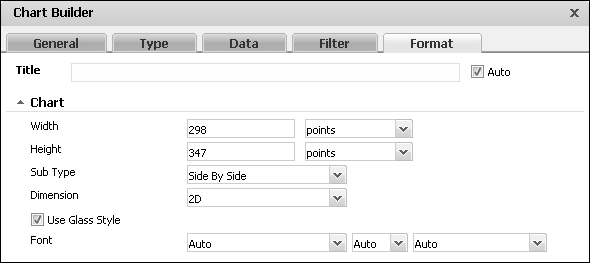
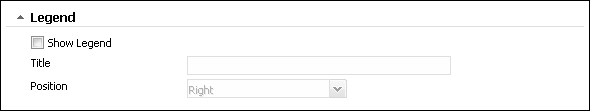
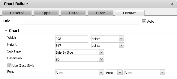
Choose edit from the gadget menu or create a new gadget to open Chart Builder. In Chart Builder, select Chart Builder—Format to see formatting options. The following formatting options are available for a bar chart:
|
n
|
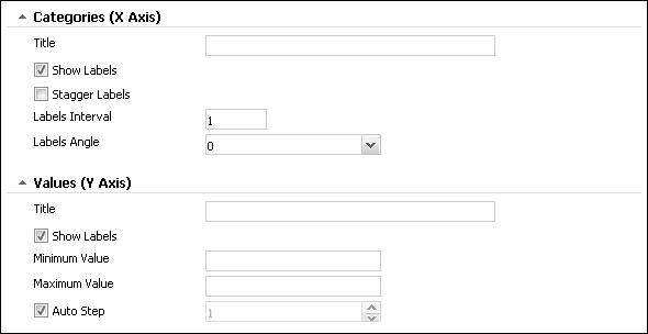
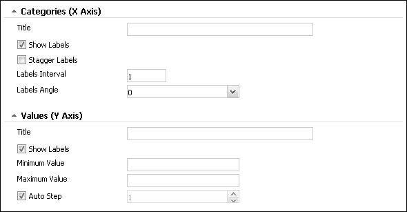
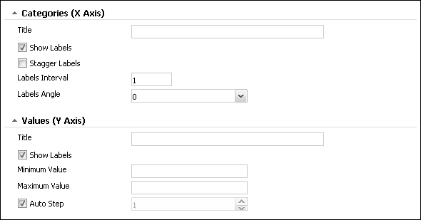
Customize the presentation of the chart’s axis values using the Categories and Values options, as shown in Figure 4-26.
|
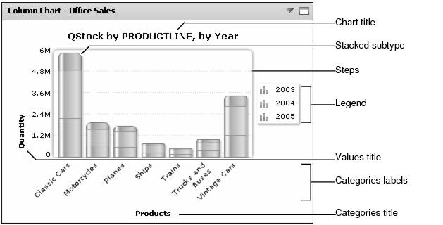
Formatting a column chart
You can format a column chart gadget to modify its appearance on a dashboard. Figure 4-27 shows the elements that you can modify.
Choose edit from the gadget menu or create a new gadget to open Chart Builder. In Chart Builder, select Chart Builder—Format to see formatting options. The following formatting options are available for a column chart:
|
n
|
Customize the presentation of the chart’s axis values using the Categories and Values options, as shown in Figure 4-30.
|
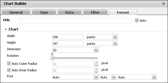
Formatting a doughnut chart
You can format a doughnut chart gadget to modify its appearance on a dashboard. Figure 4-31 shows the elements that you can modify.
Choose edit from the gadget menu or create a new gadget to open Chart Builder. In Chart Builder, select Chart Builder—Format to see formatting options. The following formatting options are available for a doughnut chart:
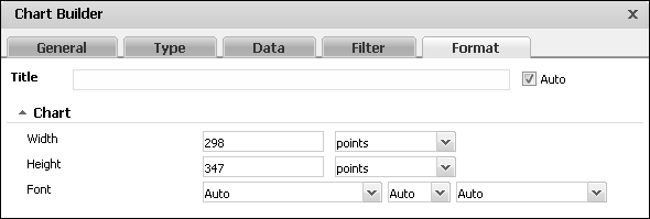
Formatting a line chart
You can format a line chart gadget to modify its appearance on a dashboard. Figure 4-34 shows the elements that you can modify.
Choose edit from the gadget menu or create a new gadget to open Chart Builder. In Chart Builder, select Chart Builder—Format to see formatting options. The following formatting options are available for a line chart:
|
n
|
Customize the presentation of the chart’s axis values using the Categories and Values options, as shown in Figure 4-37.
|
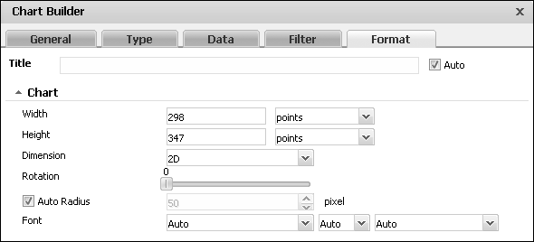
Formatting a pie chart
You can format a pie chart gadget to modify its appearance on a dashboard. Figure 4-38 shows the elements that you can modify.
Choose edit from the gadget menu or create a new gadget to open Chart Builder. In Chart Builder, select Chart Builder—Format to see formatting options. The following formatting options are available for a pie chart: