Editing a Flex table gadget
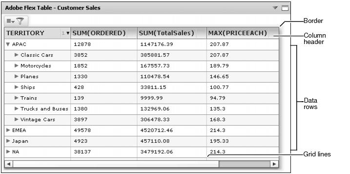
Flex table gadgets display data set values from a data object in a row and column layout.
Dashboard designers can customize Flex table gadget options using the Flex Builder—General options. For more information about general options, see Setting general gadget options, earlier in this section.
Assigning data to a flex table gadget
Adding this gadget to a dashboard or editing it, displays Flex Builder—Data, as shown in Figure 4-71. Dashboard designers select a data set from data objects already on the dashboard or add a new data object from available data objects on the BIRT iServer. Filtering data sets occurs before the data appears in the gadget.
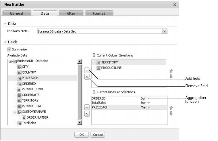
The dashboard designer assigns data to different parts of the Flex table. Flex table columns support the use of all data fields unless Summarize is selected. When Summarize is selected, the Flex table aggregates measures in the table. When fields are summarized, Current Column Selections only supports dimensions and attributes. Choose Summarize in Flex Builder—Data to enable a summary table.
Displaying a summary table requires both measures and dimensions from the data object. The table displays aggregations of the data set when summarize is selected.
Summary Flex tables can summarize measure values using the aggregation functions shown in Table 4-4:
Dashboard designers can also limit the data that appears in the gadget by using Flex Builder—Filter to create filter conditions. For more information about filtering, see Filtering data source in gadgets, earlier in this section.
Formatting a Flex table gadget
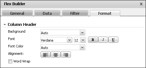
You can format a Flex table gadget to modify its appearance on a dashboard. Figure 4-72 displays Flex Builder—Format and the elements of a Flex table gadget that you can modify.
Choose edit from the gadget menu or create a new gadget to open Flex Builder. In Flex Builder, select Flex Builder—Format to see formatting options. The following formatting options are available for a Flex table gadget:
|
n
|
Customize the appearance of the table header using the Column Header options, as shown in Figure 4-73.
|
|
n
|
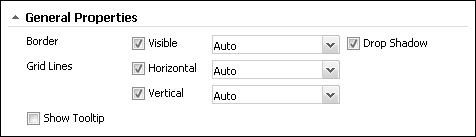
Customize the border and grid displayed in the table using the General Properties options, as shown in Figure 4-75.
|
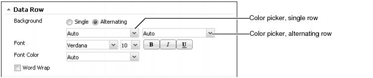
The dashboard designer can select colors for the Column Header, the Data Row, and the General Properties of the Flex table gadget. For more information about selecting colors, see Using the color picker, earlier in this section.