Using data selection gadgets
Data selection gadgets helps users select data to display in gadgets. Figure 4-81 shows the different data selection gadgets.
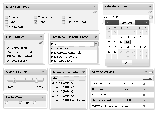
Figure 4-81 Displaying data selection gadgets
Table 4-6 describes the data selection gadgets available to use in a dashboard.
 |
Calendar gadgets display data from a data object as a calendar where a user can select day, month, or year. Users can select a single value.
|
|
 |
Check box gadgets display data from a data object with a check box next to each value. Users can select multiple check boxes.
|
|
 |
Combo Box
|
Combo box gadgets display data from a data object in a drop down box. This gadget supports manual typing and autosuggestion of values.
|
 |
List gadgets display values from a data object in rows. This gadget supports multivalue selections and searching of list items. Press the Shift key while selecting multiple, separate values; press the Control key while selecting a range of values.
|
|
 |
Radio Button
|
Radio button gadgets display data from a data object with a radio button next to each value. Users can select a single value to include.
|
 |
Slider gadgets display data from a data object as a sliding bar with tick marks next to known values. This gadget supports multivalue selections.
|
|
 |
Data Version
|
Data Version gadgets display available versions of BIRT data stores for a user to choose. Changing a data store version updates all gadgets using the data store.
|