AddOn properties
AddOn properties support the creation of custom objects, called AddOns, to add to a gadget. You can add rectangles, polygons, circles, arcs, lines, text, and images to any gadget to enhance its appearance. You can create any number of objects and arrange objects on top of or behind one another.
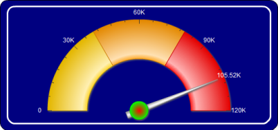
Figure 17-22 shows an example of adding two rectangles with rounded corners behind a meter gauge. To create this image, create one rectangle with a white border, then create another rectangle that is slightly larger. Use the same fill color for both rectangles. Place the larger rectangle behind the smaller rectangle.
Figure 17-22  
Figure 17-23 shows the AddOns page. AddOns lists the two rectangles added to the meter gauge. The objects are listed in z order, which is the order from front to back.
Figure 17-23  
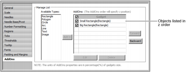
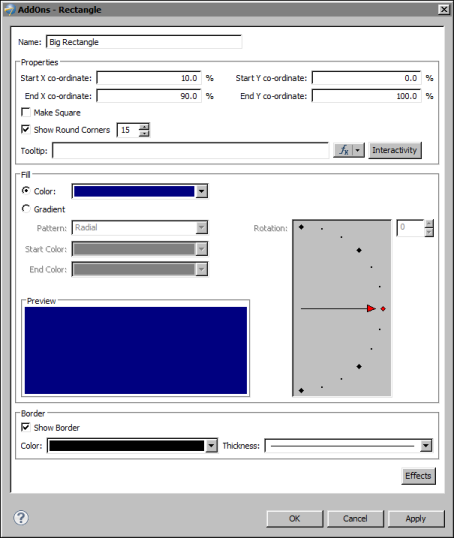
Figure 17-24 shows the properties set for the larger rectangle. Notice that the size of the rectangle is not fixed. Rather, the size is a percentage of the gadget’s size. You define an AddOn’s size by specifying values for these four properties: Start X coordinate, Start Y coordinate, End X coordinate, and End Y coordinate. By using a relative size, AddOns adjust to the size of the gadget area.
Figure 17-24  
Table 17-15 shows the properties for creating the different types of objects that you can add to a gadget.
Table 17-15  
Center X coordinate
Specifies the location, as a percentage of the size of the gadget, of the x coordinate of the object.
Center Y Coordinate
Specifies the location, as a percentage of the size of the gadget, of the y coordinate of the object.
Specifies the location, as a percentage of the size of the gadget, of the end x value of the object.
Specifies the location, as a percentage of the size of the gadget, of the end y value of the object.
Supports the selection of horizontal text alignment within the gadget.
Specifies the radius of the inner portion of the object, as a percent of the size of the gadget.
Specifies the name of the object. This name appears in the list on AddOns options.
Specifies the radius of the outer portion of the object, as a percent of the size of the gadget.
Enables or disables image scaling. Adjust the height and width of the image by percent.
Select to alter the size of the text. Adjust the scaling amount for width and height by percent.
Enables or disables the drawing of a border line around the object. Select the color and thickness of the border with the Color and Thickness drop-down menus.
Enables or disables rounded corners. Type the percent of a circle to round the corner.
Select to use a solid fill color for the object. Select a color from the associated drop-down list box.
Specifies the location, as a percentage of the size of the gadget, of the beginning x value of the object.
Specifies the location, as a percentage of the size of the gadget, of the beginning y value of the object.
TextBox Background Color
Disables or enables text wrap. Choose, by percent of the gadget, the maximum height and width for the wrap.
Specifies the location of the image for AddOn file types of .gif, .jpg, .png, or .swf.

Additional Links:

Copyright Actuate Corporation 2012