|
A general chart theme that you create with the graphical chart theme builder, and which you can apply to both BIRT and HTML5 charts.
|
|
|
A JavaScript theme that you create using JavaScript and the Highcharts API. Use this programming option to define chart attributes that are not available through the graphical chart theme builder, or if you are more comfortable writing scripts and prefer to view all attributes in text format on a single page. Unlike the general chart theme, a JavaScript theme is applicable to HTML5 charts only.
|
A typical approach to designing chart themes, whether general or JavaScript, is to create one theme for all chart types. Use this approach to design a consistent presentation style for all chart types, one that uses corporate styles, for example. Such a theme might define general attributes, such as color schemes for the chart background and plot areas, font styles for chart titles, value labels, or axis labels, border styles, and legend styles.
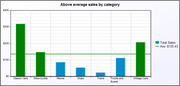
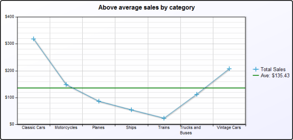
The charts in Figure 15-2 and Figure 15-3 are examples of how a bar chart and a line chart appear in a consistent style when the same theme is applied. The charts use the same color schemes, fonts, grid, border and legend styles. In these examples, the charts use a predefined chart theme, ThemesReportItems.Chart Grid. You can use the same design principles when creating custom themes.
You can create a chart theme in a report design or in a library. Create a chart theme in a library—the typical approach—to share the theme with other report developers or to use the theme in other reports. A chart theme defined in a report design is available only to charts in that report.
If an existing chart contains the formatting attributes you want to set in a theme, export the attributes to a theme. To do so, open the chart in the chart builder, then click the button at the top right side of the chart builder, and specify a name for the new theme. BIRT creates a theme that contains all the formatting attributes from the chart. The theme is created in the report that contains the source chart and is accessible through the Outline view for the report design. To place this theme in a library, copy it from the Outline view and paste it into a library.
The predefined chart themes included with Actuate BIRT Designer are defined in a library, ThemesReportItems.rptlibrary. You can download this library from the Resources folder in Actuate BIRT iServer to use as an example when creating your own library of themes.