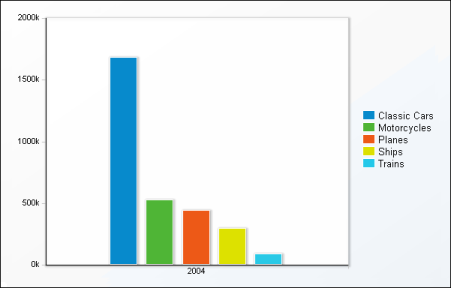
When you choose to display cross-tab data in a chart, Data Analyzer initially displays a column chart, the default chart type, as shown in Figure 6-2.
Data Analyzer provides several chart types you can use to display cross-tab data. The first step is to choose the chart type most suitable for the data. You can use any chart type to display most data, but the data is easier to read when you choose a chart type that has the best visual characteristics for a particular set of data.
For example, to show what percentage each product line contributes to a company’s total sales, use a pie chart, which is ideal for showing how parts relate to a whole. For example, to compare the sales of each product line in the current year and the previous year, use a column chart, which supports side-by-side comparisons. A line chart is appropriate for displaying linear data, such as how each product line sold over the course of five years.
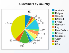
Another item to consider when choosing a chart type is the number of data values to display. Some charts, such as scatter charts, reveal trends more clearly when there are more data values. Other charts, such as pie charts, are more effective when there are fewer data values. For example, the pie chart in Figure 6-3 is difficult to read because it displays too many data values.
The following topics describe the chart types Data Analyzer supports. Several of the chart types include subtypes.