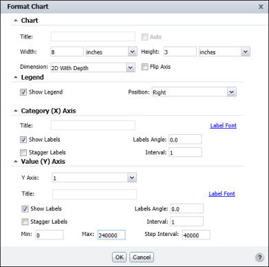
You can use Interactive Viewer to modify axes titles of a chart, and the axis labels. You can also delete axis titles, and suppress labels. Figure 8-29 shows an example of the Format Chart dialog box.
Charts other than pie charts and meter charts can have x-axis and y-axis titles. To add and format an axis title, using Format Chart, you can hide tan axis title, or modify an existing title. On Format Chart, in the y-axis section, type a title in the Title field. Then modify the font properties by choosing Title Font.
A chart displays axis labels by default, to the left of the vertical axis, and below a horizontal axis. Using Interactive Viewer, you can specify whether to hide or display labels, and modify the position and appearance of labels so that they are easier to read. For example, you can rotate or stagger the labels on the x-axis so that they are easier to fit on the chart and read. You can also modify the label font by selecting Label Font and setting new font properties.
|
Figure 8-29
|
Sometimes a chart displays so many values on an axis that the label text overlaps and is not legible. You can rotate the labels at an angle relative to the axis or stagger the labels, so that they do not overlap, as shown in Figure 8-30. For example, you can show data points for every third month, every ten days, every other year, and so on. To change the label properties, navigate to Format Chart and specify the values in the Category (X) axis title area.