|
2
|
|
3
|
|
7
|
|
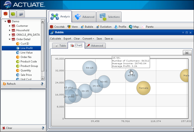
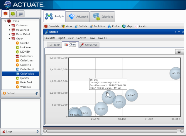
Figure 4-10
|
|
3
|
|
4
|
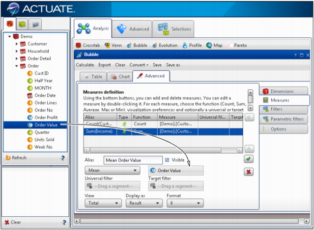
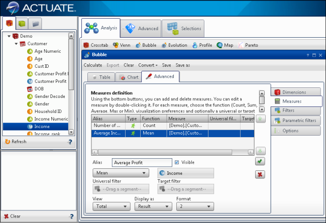
To rename an existing measure, double-click the measure and type a new name, as shown in Figure 4-13. Choose the green check mark to finalize the edit.
|
|
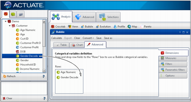
Figure 4-13
|
|
7
|
|
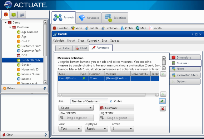
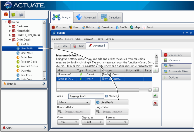
Figure 4-14
|
|
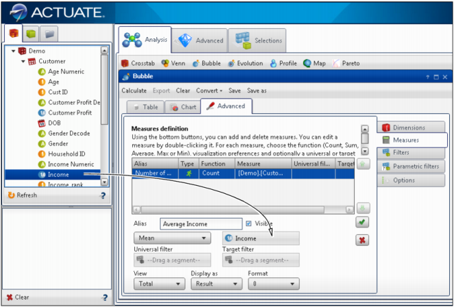
Figure 4-15
|
|
3
|
|
Figure 4-16
|