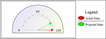
A meter chart is very effective when showing a small number of values in a prominent manner. A meter chart displays a value as a needle pointer on a circular or semicircular dial. You can use a meter chart to create a gauge or dashboard display. As Figure 8-16 shows, a meter chart resembles a speedometer, with tick marks and numbers, showing a range of values. In this example, the meter chart displays two pointers that represent two values, projected sales total and actual sales total.