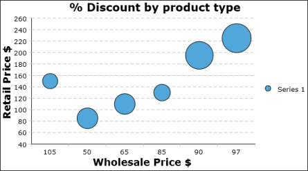
A bubble chart resembles a scatter chart, but uses bubbles instead of data points. You choose a bubble chart instead of a scatter chart if you have three values per data point. For example, Figure 8-22 shows a bubble chart that plots the retail against the wholesale prices of products, calculates the discount, and uses the size of the bubbles to show the amount of the discount. The color-coding of the bubble identifies the product type. Bubble charts typically describe financial data. Use a bubble chart when you want to represent data using more than two values.
|
Figure 8-22
|