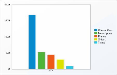
When you choose to display cross tab data in a chart, Data Analyzer initially displays a column chart, the default chart type, as shown in Figure 6-2.
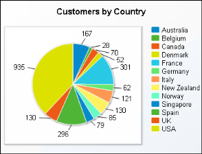
Another item to consider when choosing a chart type is the number of data values to display. Some charts, such as scatter charts, reveal trends more clearly when there are more data values. Other charts, such as pie charts, are more effective when there are fewer data values. For example, the pie chart in Figure 6-3 is difficult to read because it displays too many data values.
The following topics describe the chart types Data Analyzer supports. Several of the chart types include subtypes.