A scatter chart presents data as x-y coordinates by combining two sets of numeric values into single data points. A scatter chart typically is used to display scientific and statistical data, because it shows if there is a relationship between two sets of measurements. Use a scatter chart to compare, for example, salaries and years of experience, weight and body fat, rainfall amounts and pollen levels, or test scores and hours of study. The more data values you include in a scatter chart, the clearer the trends the data reveals.
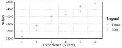
The scatter chart in Figure 8-23 shows the relationship between salary and years of experience. Each pair of values, salary and years of experience, is plotted as a single x-y value. The chart reveals a positive, or direct, relationship between salary and years of experience. As the number of years increases, the salary also increases. The chart also displays the salaries earned by men and women. In this example, the chart reveals that men consistently earn more than women.
|
Figure 8-23
|