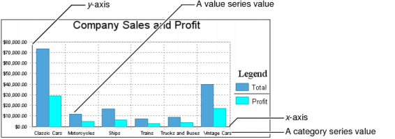
For all chart types, you must select one column as the category series and at least one column as the value series. You can select two columns to display two value series. The bar chart in Figure 8-26 displays two value series, total and profit.
|
Figure 8-26
|
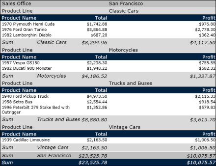
Then, depending on the table data that a chart uses, you might need to group and aggregate the values, so that the chart can display the data properly. Suppose the table displays the data in Figure 8-27. The table shows sales details by product, product line, and sales office. In Figure 8-27, the table shows only 10 rows of sample data, but the generated report contains 75 pages of data.
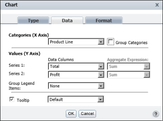
Suppose you create a bar chart based on this table data. You want the chart to show the overall sales total and profit for each product line, just like the chart in Figure 8-26. You select the product line column as the category series and the total and profit columns as the value series, as shown in Figure 8-28.
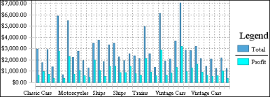
Based on these selections, the bar chart looks like the one in Figure 8-29. Because you did not group or aggregate the data for the chart, the chart plots every total value and every profit value.
To create the chart in Figure 8-26, which is based on the table data in Figure 8-27, group the chart data by product line and use the Sum function to calculate the grand total of the sales amounts and profits. Figure 8-30 shows the correct way to select and organize data for the chart.
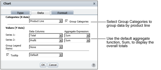
|
Figure 8-30
|