Unlike most chart types, a meter chart does not display data on a y- or x-axis. Instead, a meter chart displays each data value as a needle on a dial. A meter chart is used to emphasize a small number of values. This section shows examples of selecting and organizing data for meter charts. Each example shows the following items:
The superimposed meter chart in Figure 8-47 shows two values, actual sales and projected sales.
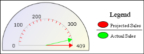
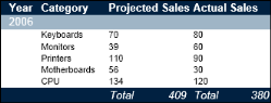
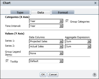
Figure 8-48 shows the table data that the chart uses. The meter chart displays the aggregate values in the measure columns of the table. Figure 8-49 shows how the data is selected for the chart.
|
Figure 8-48
|
|
Figure 8-49
|