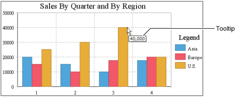
By now, you may have noticed the Tooltip option on the Chart—Data page of the chart editor. The Tooltip option is selected by default, as shown in Figure 8-58. A tooltip displays the value series value when a user hovers the mouse pointer over a bar in a bar chart, a sector in a pie chart, or a data-point marker in a line chart. Figure 8-59 shows a tooltip displaying 40,000 when the user hovers the mouse pointer over a bar in a bar chart.
You can disable the tooltip by deselecting the Tooltip option. You also can display a different tooltip value. For the bar chart in Figure 8-59, instead of displaying the sales value, you can display the region or the quarter.
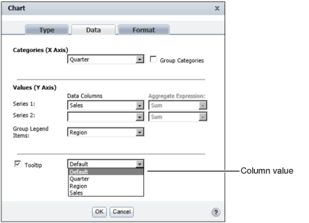
To display a different tooltip value, select a different column from the drop-down list, as shown in Figure 8-60.
|
Figure 8-59
|
|
Figure 8-60
|