Displaying x-axis labels by interval
By default, a chart displays every category value on the x-axis, unless the label does not fit in the space allocated to each category value. As described in the previous sections, to make all the labels fit, you can reduce the font size, rotate the labels, or stagger the labels. These techniques, however, can make the x-axis look crowded. If it is not essential to display every category value, you can specify that the x-axis display alternate values, or every third value, and so on.
Figure 8-74 shows a stock chart that displays open, close, high, and low prices for every trading day in August. Although Interval is set to 1, there is not enough space to display every date as a label on the x-axis, so the x-axis displays alternate values. Figure 8-75 shows the same stock chart, but this time, Interval is set to 5 to display the first trading date per week.
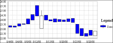
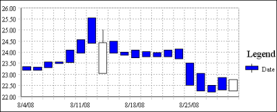
As the chart in Figure 8-75 shows, it makes sense to skip category values only if the values are consecutive numbers or dates, where the user can intuitively fill in the missing values.