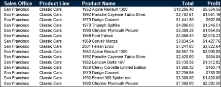
Compare the reports in Figure 4-6 and Figure 4-7. The report design in Figure 4-6 displays sales information in a simple list. The data rows are sorted by sales office, then by product line. Notice the repeated sales office name and product lines.
|
Figure 4-6
|
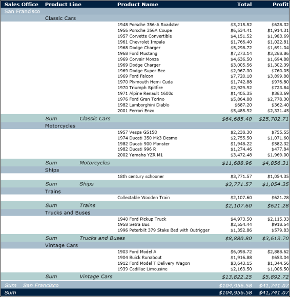
The report design in Figure 4-7 shows the same data. Unlike the report design in Figure 4-6, this design groups the rows by sales office then by product line. Data appears in a hierarchy. The report design does not contain repeated values for office names and product lines. In addition, totals, displayed in italics, appear at the end of each product line and sales office group.
As the example reports Figure 4-6 and Figure 4-7 show, a report design that groups data provides a more effective way to view data. When you group data, you can:
|
|