You can insert standard charts at the table level in a summary table. The types of standard charts you can use in a summary table are the same as those available for use in a detail table. BIRT Studio assigns the outermost grouped column as the category or x-axis, by default, as shown in Figure 6-21. You can select the value series on the y-axis from the available measure columns in the summary table.
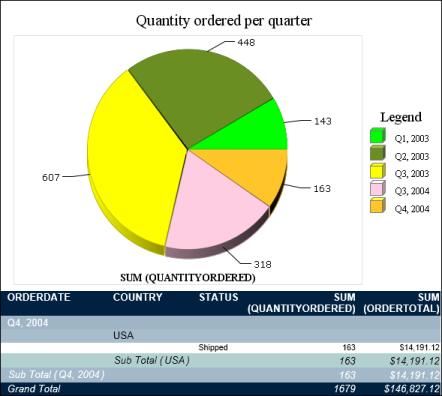
The example in Figure 6-21 displays a pie chart showing the total product quantities ordered each quarter. The outermost grouped column is Order Date, which BIRT Studio sets as the category axis. You can choose either of the two measure columns as the y-axis, or both to display multiple value series.
|
Figure 6-21
|