Formatting data selection gadgets
Each gadget type has different formatting options to assist user choices using the gadget. These options are available in Data Selector Gadget Wizard—Format.
Additionally, the following data types can be formatted for display in data selection gadgets:
|
n
|
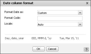
Date column format, shown in Figure 4-86. Supports locale selection, different date formats, custom formatting and unformatted options.
|
|
n
|
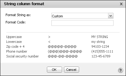
String column format, shown in Figure 4-87. Supporting uppercase, lowercase, custom formatting and unformatted options.
|
|
n
|
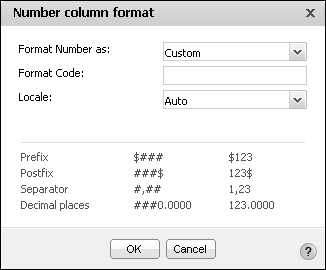
Number column format, shown in Figure 4-88. Supporting general number, currency, fixed, percent, scientific, custom formatting and unformatted options.
|
Formatting a calendar gadget
You can format a calendar gadget to modify its appearance on a dashboard. Figure 4-89 shows the elements you can modify.
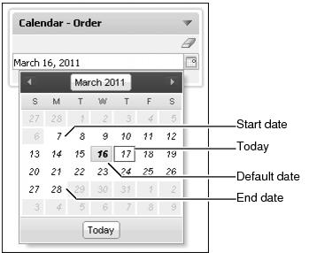
Calendar gadgets support a default value, start date, and end date, as shown in Figure 4-90. The user can change the date to another value but the new value must be between the start and end dates.
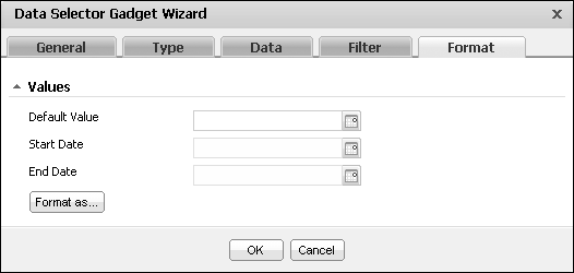
When a data object is assigned to the calendar gadget, the start and end dates are taken from the date values in the data object. The dashboard designer can set a custom start date and end date when the binding option in Data Selector Gadget Wizard—Data is set to no binding.
Using Format as... the dashboard designer can format the look and locale of the date value. For more information about date format options, see Formatting data selection gadgets, earlier in this section.
Dashboard designers can customize calendar gadget options using the Data Selector Gadget Wizard—General options. For more information about general options, see Editing a data selection gadget, earlier in this section.
Formatting a check box gadget
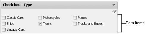
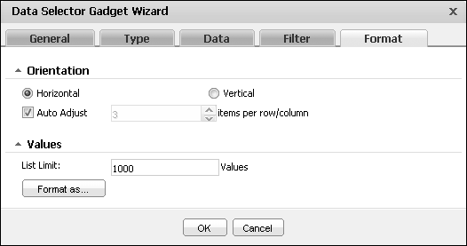
You can format a check box gadget to modify its appearance on a dashboard. Figure 4-91 shows the elements of a check box you can modify.
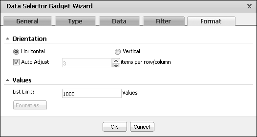
Check box gadgets support a horizontal or vertical orientation, as shown in Figure 4-92. The developer can set a fixed or automatic number of items per row or column. The List Limit sets the number of data values that can appear in this gadget.
Dashboard designers can customize check box gadget options using the Data Selector Gadget Wizard—General options. For more information about general options, see Editing a data selection gadget, earlier in this section.
Formatting a combo box gadget
You can format a combo box gadget to modify its appearance on a dashboard. Figure 4-93 displays the elements that you can modify.
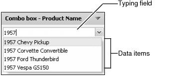
Combo box gadgets can display a default value and a list limit, as shown in Figure 4-94.
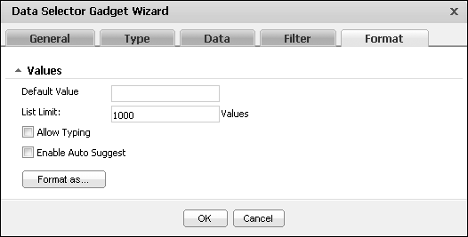
Select Allow Typing to support typing into the combo box to quickly find a known value. Enable Auto suggest to present users with matching data as the user types a value.
Dashboard designers can customize combo box gadget options using the Data Selector Gadget Wizard—General options. For more information about general options, see Editing a data selection gadget, earlier in this section.
Formatting a list gadget
You can format a list gadget to modify its appearance on a dashboard. Figure 4-95 displays the elements you can modify.
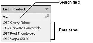
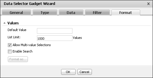
List gadgets can display a default value, a list limit, multivalue selections and a search box, as shown in Figure 4-96.
Dashboard designers can customize list gadget options using the Data Selector Gadget Wizard—General options. For more information about general options, see Editing a data selection gadget, earlier in this section.
Formatting a radio button gadget
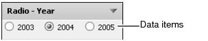
You can format a radio button gadget to modify its appearance on a dashboard. Figure 4-97 shows the elements you can modify.
The developer can set a fixed or automatic number of items per row or column. The List Limit sets the number of data values that can appear in this gadget.
Radio button gadgets support a horizontal or vertical orientation, as shown in Figure 4-98.
Dashboard designers can customize radio button gadget options using the Data Selector Gadget Wizard—General options. For more information about general options, see Editing a data selection gadget, earlier in this section.
Formatting a slider gadget
You can format a slider gadget to modify its appearance on a dashboard. Figure 4-99 shows the elements you can modify.
Slider gadgets support a horizontal or vertical orientation, as shown in Figure 4-100. The range of values appearing on the slider is automatically adjusted based on the data displayed or you can set a minimum and maximum value.
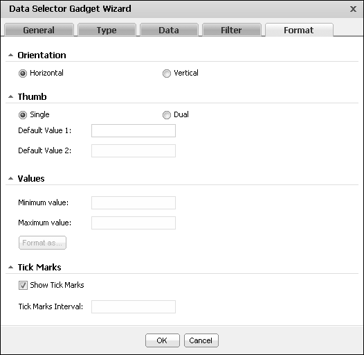
When Auto adjust tick marks is enabled, the tick marks appear on the slider. The developer can set the number of tick marks by Disabling Auto adjust tick marks interval.
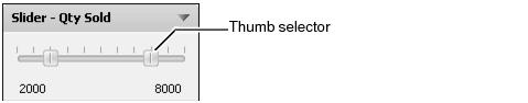
One or two thumb selectors can display for user to interaction. Using two thumb selectors enables the user to select a minimum and maximum value. Using one thumb selector makes additional data operators available.The developer can set default values for the thumb selectors to start from.
When a data object is assigned to the slider gadget, the minimum and maximum values are taken from the values in the data object. The dashboard designer can set a custom minimum and maximum value when the binding option in Data Selector Gadget Wizard—Data is set to no binding.
Dashboard designers can customize slider gadget options using the Data Selector Gadget Wizard—General options. For more information about general options, see Editing a data selection gadget, earlier in this section.