Our first sample shows you how to create a basic, filtered Crosstab analysis in a few seconds, doing everything in the default “Table” view. The second sample procedure shows you how to quickly create a simple pivoted Crosstab. The third and fourth procedures show you how to build more complex Crosstabs.
01 - How to create a very simple Crosstab Analysis
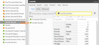
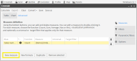
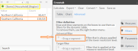
1 Go to the default “Table” view of the Crosstab analysis tool. Click on the Database icon directly above the Data Tree panel. The database symbol, along with the name of the database, appears in the panel. In this case we are using our “Demo” database. Click on the symbol to display the available tables in the database. Note: If you do not have access to our Demo database in your BA installation, you can use similar tables from your own company database to create this Crosstab.
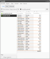
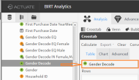
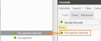
2 Then drag the “Occupation Decode” column from the “Customer” table in the Demo database tree and drop it into the “Rows” panel to start defining dimension rows. Now do the same thing with the “Gender Decode” column, dragging it into the “Rows” panel.
Figure 4‑14 Table view of Crosstab results including Null values
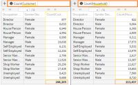
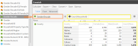
3 See Figure 4‑14 above. A default measure “Count(Customer)” now appears in the measure field in the Table view. It was set automatically when you defined your first dimension row. The measure is applied automatically on the dimension rows and the results are displayed in the main “Table” panel. They are grouped by occupation and gender based on the Customer table.
4 Remove the distracting Null value fields by clicking on “Occupation Decode” in the “Rows” panel to access the window for editing its discrete values. Uncheck the empty field at the top to remove the null values from your calculations and click “Accept”. Do the same thing to remove the null values from the “Gender Decode” dimension.
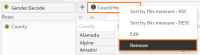
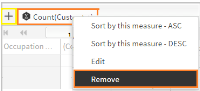
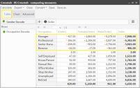
5 Click on the default measure and then choose “Remove”. While still in the main view, change the measure resolution by dragging the “Household” table from the Data Tree into the measure field where the Count(Customer) measure used to be displayed before we removed it. As the resolution is now “Household”, the results are now based on the “Households” table. (See Figure 4‑15below). The results are not the same when counting households as they were when counting customers. This shows the importance of resolution changes.
Figure 4‑15 Comparing results
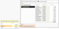
6 Now add a Universal filter to the analysis, (filtering by households with only females living in them) by dragging the “Female” segment from the “Gender Decode” discrete values accessed in the Data Tree and dropping it in the “Filter” field in the “Table” view. Note: This filter has been applied before the resolution change (at the Customer level). (See Figure 4‑16 below for your results).
Figure 4‑16 Adding a Universal filter to the Crosstab analysis
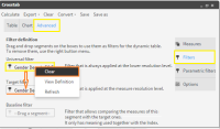
7 This time apply the same filter after the resolution change (at the Household level) by adding a Target filter instead of the Universal filter. Do this by opening the “Filters” tab of the Advanced view and dragging our filter from the “Universal filters” field and dropping it into the “Target filters” field. Finally you need to remove the previously used Universal filter from its field by clicking on it and choosing “Clear”. (See Figure 4‑17 below).
Figure 4‑17 Replacing the Universal filter with a Target filter
8 Click “Calculate” in the Toolbar. Your new results are displayed in the Table view (See Figure 4‑18 below).
Figure 4‑18 Table results after applying the Target filter
9 These results contain values that did not appear in the previous results where the filtering was done before the resolution change (Universal filter). Here, all the extra values grouped as “Male” represent households with males (having the designated occupation) AND where at least one female lives.
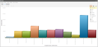
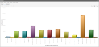
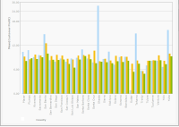
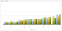
10 Open the “Chart” view to see the graphic display of the results (See Figure 4‑19 and Figure 4‑20 below) that show you the graphic results for both filtering situations
Figure 4‑19 Chart view with Universal filter (applied before resolution change
Note: We changed the type of chart display to “Column 3D” by choosing it in the “Chart” icon dropdown list.
Figure 4‑20 Chart view with Target filter (applied after resolution change).
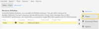
You have now finished your analysis. Several possibilities are available to you, using the various tabs and icons on the Crosstab main screen, such as saving, exporting or even converting it to another type of analysis.
Note: It is also possible to export a Crosstab analysis directly to the FastDB engine, creating a new table in the database. This is done by selecting the new option “Analytic DB” from the dropdown list of the “Export” tool found in the Crosstab toolbar.
02 - How to create a simple Pivoted Crosstab Analysis
Here we will show how to make a pivoted Crosstab analysis showing a company’s average profit from customers in each county in California, grouped by gender.
1 Open the main analysis window and click on “Crosstab” which opens the Crosstab Table view (by default).
2 Click on the Database icon directly above the Data Tree panel. The database symbol, along with the name of the database, appears in the panel. In this case we are using our “Demo” database. Click on the symbol to display the available tables in the database. Note: If you do not have access to our Demo database in your BA installation, you can use similar tables from your own company database to create this Crosstab.
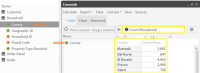
3 Define the first dimension by dragging the “County” column into the Row panel next to the Data Tree. Setting the first dimension row, using a column from the “Household” table, automatically sets a measure on that table with the default Count operator (See Figure 4‑21 below).
Note: Because the “Autocalculate” option is turned on by default, the counted Product Group results automatically appear in the main panel of the Crosstab Table view.
Figure 4‑21 Defining a Dimension row
4 Next we define the second dimension by dragging the “Gender Decode” column into the “Pivot column” field at the top of the Table view. (See Figure 4‑22 below). Note: Setting the second dimension does not change the default “Count” measure that was set on the “Household” table when we created the “County” dimension row.
Figure 4‑22 Defining a Dimension column (for pivoting)
5 While still in the “Tab” view, eliminate the default measure by clicking on it and choosing “Remove” in the dropdown menu that appears. Then click the [+] icon beside the “Measure” field. (See Figure 4‑23 below).
Figure 4‑23 Removing the default measure
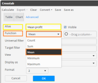
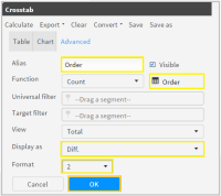
6 In the “New Measures” window that opens, it is mandatory to name your new measure. Because you wish to calculate the average profit per customer, enter “Mean profit” in the “Alias” field.
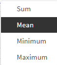
7 Next select the operator you want to use from the dropdown list in the “Function” field. Here you choose “Mean” because you want to calculate average profit. (See Figure 4‑24 below).
Figure 4‑24 Choice of measure operator
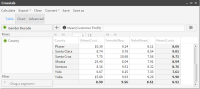
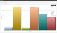
8 The final results appear immediately in the “Table” view. Click on “Chart” to view them graphically. They appear as columns, the default view. (See Figure 4‑25 and Figure 4‑26 below).
Figure 4‑25 Table view of results
Figure 4‑26 Chart view of results
9 You have now finished your analysis. Several possibilities are available to you, using the various tabs and icons on the Crosstab main screen, such as saving, exporting or even converting it to another type of analysis.
Note: It is also possible to export a Crosstab analysis directly to the FastDB engine, creating a new table in the database. This is done by selecting the new option “Analytic DB” from the dropdown list of the “Export” tool found in the Crosstab toolbar.
03 - How to create a Non-Pivoted Crosstab Analysis
The following steps will show you how to create a more complex Crosstab for an international company that will allow management to analyze their sales results in southern California. Our Crosstab analysis will find the sales figures per product as well as their average profit from the sale of each product in order to use these measurements to calculate the total profit by product group in southern California.
1 Open the main analysis window and click on “Crosstab” which opens the Crosstab Table view (by default).
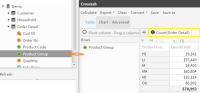
2 Expand the database tables in the Data Tree. Define a dimension row by dragging the “Product Group” column into the Row panel next to the Data Tree. Setting the first dimension row, using a column from the “Order Detail table”, automatically sets a measure on that table with the default Count operator.
Because the “Autocalculate” option is turned on by default, the counted Product Group results appear in the main panel of the Crosstab Table view. (See Figure 4‑27 below).
Figure 4‑27 Creating the first dimension
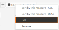
3 Step 3: Edit the default measure by clicking on it in the Measure field and choosing “Edit” in the dropdown list that appears. (See Figure 4‑28 below).
Figure 4‑28 Measure field drop-down Options list
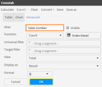
4 The “New Measures” window opens displaying the default Count(OrderDetail) measure ready for editing. In this case, change the name (Alias) to “Sales number”. Then click “OK”. (See Figure 4‑29 below).
Figure 4‑29 New Measure screen
5 Go to the default Measures screen in the “Advanced” view tab. It now displays your first measure with its new name “Sales number”. Click the “New Measure” button at the bottom of the Measures tab to open the New Measures screen again, ready for you to add your second measure to the analysis. (See Figure 4‑30 below).
Figure 4‑30 New Measure button
6 Our second measure will be used to calculate the average profit from the sale of each product. Start by naming the measure “Average profit”. Then select the “MEAN” operator in the “Function” field. (See Figure 4‑31 below).
Figure 4‑31 Creating a measure
7 “Drag a column” appears (see figure above) inviting you to drag the column to be operated on by the measure into the field next to the Function field. Drag the “Line profit” column, from the “Order Detail” table in the Data Tree, into the “Drag a column” field. (See Figure 4‑32 below).
Figure 4‑32 Setting the second measure in “Drag a column” field
8 Complete your measure by setting the number of decimal places to “2” in the “Format” field (near the bottom of the window) and click “OK” to save your measure and go back to the Measures tab in the Advanced view. See Figure 4.29 above.
9 Back in the Measures tab, where both your measures are now displayed, select the Mean profit measure and click on the “New Formula” button.
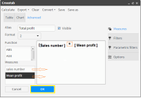
10 In the formula window that opens you will need to create a further calculation formula for your analysis (based on the Mean profit measure that you have just created). This is necessary to be able to obtain the total profit results. Name your formula “Total profit”.
11 Drag the “sales number” measure from the “Measures” field into the blank work area located on the right of the measures box, followed immediately by the “Mean profit” measure. Now place the multiplication symbol ”*” between the two measures being careful to stay outside of the brackets: [sales number]*[Mean profit]. (See Figure 4‑33 below).
Figure 4‑33 New Formula window
12 Set the “Format” field to “2” decimal places and click “OK” to save the calculated measure and to return to the Advanced view of your Crosstab.
13 Back in the “Advanced” view, open the “Filters” tab. Here you must drag the segment “Southern California” in to the “Universal” filter field. Note: You obtain the desired segment in the Data Tree by opening the discrete values of the “Region” column located in the “Household” table of the “Demo” database. (See Figure 4‑34 below).
Figure 4‑34 Creating a Universal filter
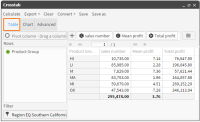
14 Click “OK” to save your filter. Go back to the Crosstab “Table” view to see your completed Crosstab analysis as a table or open the Chart view to see it graphically displayed. (See Figure 4‑35 and Figure 4‑36 below).
Figure 4‑35 Table view of results
Figure 4‑36 Chart view of results
You have now finished your analysis. Several possibilities are available to you, using the various tabs and icons on the Crosstab main screen, such as saving, exporting or even converting it to another type of analysis.
Note: It is also possible to export a Crosstab analysis directly to the FastDB engine, creating a new table in the database. This is done by selecting the new option “Analytic DB” from the dropdown list of the “Export” tool found in the Crosstab toolbar.
04 - How to make Comparisons using a Crosstab Analysis
Here you build a crosstab analysis to determine a purchasing trend based on the difference between the number of orders placed in 2003 and 2004 crossed by occupation and gender.
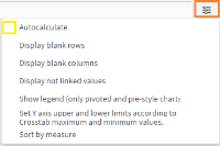
1 Go to the main window of the Analysis “Crosstabs” tool. Click on the “Options” icon on the upper right and uncheck the “Autocalculate” box shown below in Figure 4‑37.
Figure 4‑37 Autocalulate option (de-activated)
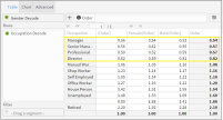
2 Create the first dimension by dragging the “Gender Decode” column (in the customer table) into the pivot column field as shown below in Figure 4‑38.
Figure 4‑38 Setting the first dimension - Pivot column (Y-axis)
3 Create a second dimension by dragging the “Occupation Decode” column into the rows panel as shown below in Figure 4‑39.
Figure 4‑39 Setting the second dimension - Dimension Row (X-axis)
4 Remove the default measure “Count(Customer)” that was created when setting the first dimension. Click on it and choose “remove” from the dropdown list that appears (as shown below in Figure 4‑40).
Figure 4‑40 Removing the default measure
5 While still in the main “Table” view window, click on the [+] icon next to the measure field to create a new measure in the “Advanced” tab “New measure” window that opens. (See Figure 4‑41). In this case the fields are already populated for the new measure that we are about to create in the next 4 steps.
Figure 4‑41 New Measure window with defined “Order” measure
6 Enter the measure name “Order” in the “Alias” field (mandatory field).Then Drag the “Order” table into the field next to the “Alias”.(This changes the resolution of the measure compared to the previous default measure).
7 Click on the arrow in the “Display as” field and choose “Diff” in the dropdown list that appears. Note: This will display the difference in size (in units) between the Base and Target filters that we are soon going to create.
8 Click “OK” to save your measure. This opens the “Advanced’ view tab that now displays your new measure.(See Figure 4‑42 below).
Figure 4‑42 Advanced view Measures tab
9 Now click on the “Filters” tab in the “Advanced” tab. This opens the “Filter definition” window. (See Figure 4‑43 below). Note: Defining filters requires finding or creating the necessary segments to be dragged into the chosen “Filter” fields in the “Filter definition” window. In this case we will need to use the “Range selection” tool in order to create 2 segments – one for 2003 and the other for 2004.
Figure 4‑43 Filter Definition window
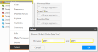
10 Make a right-click on the “Order Date Year” column in the “Order” table and choose “Select” in the dropdown list that opens. This opens the “Select” window where you can specify ranges based on years.
Set the range in this window to go from “Between” 2004 “and” 2004, as shown above. Click “OK” to close the “Selection” window and send the new range segment (year 2004) into the Scratchpad. (See Figure 4‑44 below).
Figure 4‑44 Preparing filter segments using the “Select” ranges tool
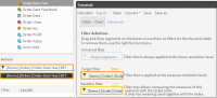
11 Drag this segment (year 2004) from the Scratchpad into the “Target” filter field in the “Filter creation” window. (See Figure 4‑45 below).
Figure 4‑45 Dragging the year segments into the corresponding filter fields
12 Repeat the operations done in steps 10 and 11 to create your Base filter. This time setting your range from “Between” 2003 “and” 2003. Then click “OK” to close the window and send the new range segment to the Scratchpad.
13 Drag this second segment (year 2003) into the “Base” filter field in the “Filter definition window. (See Figure 4‑45).
14 Now that both filters have been specified, click “Calculate” in the toolbar at the top of the window. The results are now displayed in the Table view. (See Figure 4‑46below).
Note: There are several negative results. A negative result indicates a reduction in orders placed in 2004 (Target filter) compared with orders placed in 2003 (Base filter).
Figure 4‑46 Table view of your calculated analysis
15 Click on the “Chart” view to see a graphic display of the results, shown as columns (default chart). If you want the results displayed in a different type of chart, click on the “Charts” icon and choose your chart in the dropdown list. (See Figure 4‑47 below).
Figure 4‑47 Chart view of your analysis
16 You have now finished your analysis. Several possibilities are available to you, using the various tabs and icons on the Crosstab main screen, such as saving, exporting or even converting it to another type of analysis.
Note: It is also possible to export a Crosstab analysis directly to the FastDB engine, creating a new table in the database. This is done by selecting the new option “Analytic DB” from the dropdown list of the “Export” tool found in the Crosstab toolbar.
05 - How to change the type of analysis results to be displayed
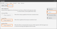
You can easily change the way your information is displayed in an analysis by simply changing the “Result” parameter in a defined measure.
1 Open the Crosstab analysis that you have just created above and click on the defined measure in the “Measure” field in the Crosstab “Table” view and choose “Edit” from the dropdown list. This opens the measure in the “Measures definition” window.
2 Click on the “Result” box at the bottom and choose “Index” from the dropdown list that appears. This will display the difference between the compared groups. (Target/Total) / (Baseline/Total).
3 Click “OK” and then click on “Calculate” in the toolbar at the top of the window. This opens the “Table” view where your results are now displayed very differently with no negative values. (See Figure 4‑48).
Figure 4‑48 New Table results with no negative values
4 Go back to the Chart view and click on the chart icon to choose 3D columns for your display. (See Figure 4‑49 and Figure 4‑50 below). Your chart appears as a 3D column display.
Note: The way the results are displayed now, values > 1.0 indicate that more orders were placed in 2004 than in 2003.
Figure 4‑49 Choosing your Chart display
Figure 4‑50 New 3D column Chart display of your analysis results