A bubble diagram shows the distribution of categorical data across two axes of numeric variables. You can also view results on a data table.
Use a third variable to set the size of each bubble. To configure a bubble analysis, set two or three variables: two on the axes and an optional third to size the bubbles.
Instead of showing measures by attributes or categorical variables, as in the case of crosstabs, a bubble diagram shows groups or categories according to numeric variables, providing a different way of showing numeric data instead of categorical data. For example, you can examine customers by age, order amounts, and average salary.
Drag a field to use as a categorical variable, such as profession, gender, age ranges, or number of children. Next, select continuous or numeric variables, such as age, salary, or purchase amount. The continuous variables are the axes of the analysis. For each variable, choose a function, such as count, sum, average, maximum, minimum, and a display type, such as percentages or totals. Optionally choose a universal or target filter that applies only to this variable or measure.
You can set filters on a bubble analysis at either the measure level or at the complete analysis level. For example, you can set a partial filter when you are analyzing customers by age, and you need to view the order average for only the last month. You also, however, want to verify the average salary for these age ranges, so you do not want the filter to be applied at the global‑analysis level, only at the order‑measure level.
You can use parametric filters as analysis filters.
Results can be sorted in ascending or descending order by measures.
The option Show legend is only available for pivoted and pie-style charts, but there is also an option to set the maximum number of characters to display in chart labels. Hide chart labels by setting the maximum number of characters to 0.
The legend configuration is bound to the chart configuration, so if the chart configuration (type, rows, columns, or filters) changes, the legend changes. When you select a pie-style chart, choosing a value label separates the corresponding piece of the pie, but when the bubble is multidimensional, choosing a value label hides its graphical representation.
You can convert this type of analysis into a crosstab analysis.
01 How to create a Bubble Analysis
1 Open the main analysis window and choose “Bubble” which opens the Bubble Table view.
2 Click on the Database icon directly above the Data Tree panel. The database symbol, along with the name of the database, appears in the panel. In this case we are using our “Demo” database. Click on the symbol to display the available tables in the database. Note: If you do not have access to the Demo database, you can use similar tables from your own company database to create this Crosstab.
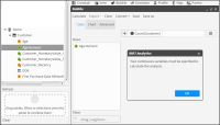
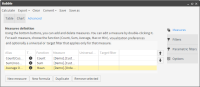
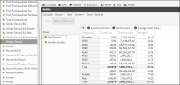
3 Define the categorical continuous variable by dragging the “Age Numeric” column from the Data Tree into the “Row” panel in the main Bubble window. A message that you must specify two continuous variables to calculate the analysis appears, as shown in Figure 4‑92. Choose “OK” to continue defining your variables. Note: Defining your first variable sets your first measure based on the table that contains the chosen column and on the default “count” operator. In this case “Count(Customer)”. It appears in the field beside the [+] icon, as you can see in Figure 4‑93.
Figure 4‑92 Defining a continuous variable for a Bubble analysis
4 Next define the second continuous variable by dragging the “Income” column into the main panel of the Bubble Table view. A pop-up list of operators appears. Choose “Sum”, as shown in Figure 4‑93.
Figure 4‑93 Defining the second continuous variable for a bubble analysis
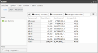
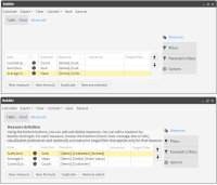
5 Defining your second variable sets a second measure, also based on the Customer table and the choice of your operator “Sum”. The new measure appears next to the first measure in the Measure field of the Bubble Table view, as shown in Figure 4‑94. Note: Because the “Autocalculate” option is turned on by default, the calculated results of the customer count (grouped by age) and the corresponding total incomes now appear in the Bubble Table view.
Figure 4‑94 Calculated results in the Table view
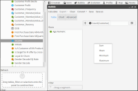
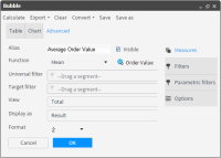
6 It is mandatory to name your new measure. Because you want to calculate the average order values per customer age group, type “Average Order Value” in the “Alias” field and choose “Mean” in the functions dropdown list below the “Alias” field.
7 To set the third continuous variable, open the “New Measure” window by choosing the [+] icon to create a new measure based on order values. The results of this third measure will determine the size of the bubbles in the analysis chart.
8 Drag the “Order value” column from the “Order” table in the Data Tree and drop it in the Drag acolumn field beside the functions field. Set the number of decimal places to 2 using the “Format” field dropdown list. Choose “OK”, as shown in Figure 4‑95. Note: the “Visible” box is checked. If it is unchecked, the results will be calculated but they of will not appear.
Figure 4‑95 Defining a new measure for a bubble analysis
9 The “Measures” screen in the Advanced view tab opens again. It now displays all three calculated measures that have been created, as shown in Figure 4‑96.
Figure 4‑96 Measures list in the Advanced view Measures tab
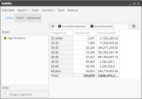
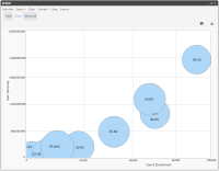
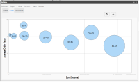
10 Click “Calculate” in the Bubble menu toolbar. You can now see all your results in the “Table” view that opens. Click on the “Chart” tab to see your results displayed as a Bubble chart, as shown in Figure 4‑97 and Figure 4‑98.
Figure 4‑97 Results of the three measures grouped by age
Figure 4‑98 Results displayed with Average Order Values setting bubble size
Saving and exporting a bubble analysis
Your Bubble analysis can now be saved or exported or even converted to a Crosstab:
Saving: Choose “Save” or “Save as” to save your analysis in your Analysis folder or elsewhere.
Exporting: Choose “Export” to export your analysis as a CSV file.
Choose the “Export” icon to export your analysis as a PDF file.
Choose the “Image” icon to export your chart as an image file.
Converting: Choose “Convert” to convert your Bubble a Crosstab analysis. Figure 4‑99 shows your Bubble analysis now displayed as a Crosstab analysis.
Figure 4‑99 Bubble analysis after conversion to a Crosstab analysis
How to duplicate an existing measure
You can duplicate an existing measure to create a new one (based on the existing one) that you can use with a different column or table, depending on the type of operator used. This is done by using the “Duplicate” button located at the bottom of the “Measures” tab in the “Advanced” view.
1 Select the desired measure in the Advanced view table and choose “Duplicate”. This opens the measure in the New measures screen with all the necessary fields populated.
2 Enter a new name in the “Alias” field.
3 Drag the new column (or table) to be used from the Data Tree into the “Drag a column or table” field and click “OK”. Your new measure appears in the Measures list in the “Measures” tab of the “Advanced” screen.
4 Click “Calculate” in the Toolbar when you are ready to apply it to the analysis.
02 How to change the Bubble Chart display
The way that your results are displayed in the Chart view can be significantly changed by changing the order of the measures in the Advanced “Measures” tab.
1 Open the Bubble analysis that you have created in the previous procedure. Then open the Advanced tab where all your measures are displayed in a table.
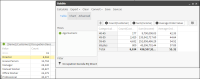
2 Select the Count(Customer) measure and use the down arrow button to move it to the bottom of the table so that it now appears in the table as the 3rd and last measure, as shown in Figure 4‑100.
Figure 4‑100 Changing the order of Bubble measures
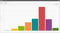
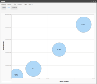
3 Choose “Calculate”. The Sum(Income) measure is now the categorical measure and the third measure “Count(Customer)” will now determine the size of the bubbles. Now the largest bubble will represent the age group containing the most customers, as shown in Figure 4‑101.
Figure 4‑101 New display with age group size determining bubble size
03 How to add a Filter to a Bubble analysis
1 Open your previous Bubble analysis – using the “Age Numeric” column as the categorical variable.
2 In the Table view, drag the filter segment “Director” from the discrete values of the “Occupation Decode” column in the Data Tree and drop the segment into the main Table view panel. This populates the “Filter” box and the filtered results appear, replacing the previous results, as shown in Figure 4‑102.
Figure 4‑102 Filtering a Bubble analysis
3 Open the Chart view to see the new Bubble chart filtered by “Director” – now showing only 4 bubbles, as shown in Figure 4‑103.
Figure 4‑103 Chart view of the analysis filtered by Directors
04 How to display multiple segments in a Bubble Chart
1 Go to the “Table” view of the Bubble analysis window and re-open your saved “First Bubble” analysis. The first categorical variable “Age Numeric” is displayed in the “Rows” panel.
2 Define a second categorical variable by dragging the “Gender Decode” column from the Customer table in the Data Tree and dropping it into the “Rows” panel.
The Table view immediately displays the newly calculated measure values, this time grouped by gender. They also include Null values, as shown in Figure 4‑104.
Figure 4‑104 Defining a second categorical variable for your analysis
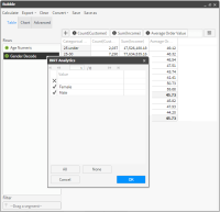
3 To remove the Null values, first double-click the “Gender Decode” variable in the “Rows” panel. This opens a window displaying its discrete values. Then remove the checkmark next to the empty row, as shown in Figure 4‑105.
Figure 4‑105 Removing Null discrete values from the Gender Decode variable
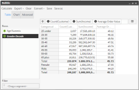
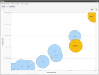
4 Click “OK” to see your Bubble results displayed without any distracting Null values, as shown in Figure 4‑106 and Figure 4‑107.
Figure 4‑106 Table results showing both variables
Figure 4‑107 Bubble analysis Chart results for both variables