A crosstab is an analysis tool that enables you to cross different data fields either in the same database table or different tables. For example, a sales manager can cross a “processed orders” field with a “type of articles” field to obtain (after adding calculated measures), the average profits generated or the sum of the purchase amounts, etc. The results are displayed as both dynamic tables and graphics. See practical, hands-on examples in “Sample procedures for creating crosstabs.”
Understanding Crosstabs
A dimension is an axis of the Crosstab -- i.e. one of the fields which is to be crossed with another field to provide an analysis of their data. When building a basic Crosstab analysis, you choose the database column or columns to be used as a dimension by dragging them into the row field and applying measures and filters.
It is also possible to pivot a Crosstab analysis by dragging the database column (to be used as a pivot) into the column field. This defines a special second dimension for the analysis, populating both X and Y axes - the first dimension “X” determined by a row(s) and the other dimension “Y” determined by the chosen pivot column. Pivoted results are presented according to the crossing of the values of the pivot column with the discrete values of the dimension rows and any applied measures and filters.
The discrete values in a database column that you choose to define as a dimension variable in your Crosstab are used as labels for dimension rows in the analysis. Options are made available for editing or clearing a discrete value by selecting its corresponding dimension variable.
When dimension rows are created, cell values are automatically calculated for them through the application of a default measure (with a “count” operator) based on the database table that contains the chosen column. A Crosstab analysis must have at least one measure or no calculation operations can be completed. When building your analysis you create/change measures to suit your needs.
Crosstab window environment
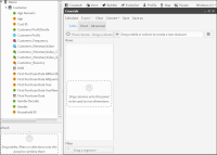
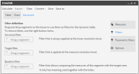
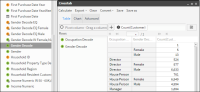
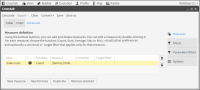
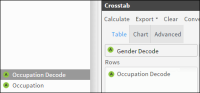
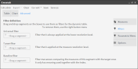
Before starting, you need to understand the Crosstab window environment. Choosing “Crosstab” in the main “Analysis” tool window opens the Crosstab “Table” view where you build your Crosstab analysis. Basic information appears on how to start using the window immediately. You can build a Crosstab analysis directly in this window, in a few seconds, by dragging and dropping your chosen fields (columns) from the Data Tree on the left into the corresponding fields and panels, as shown in Figure 4‑39.
Figure 4‑39 Crosstab Table view with explanatory panels
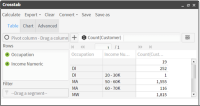
The main panel on the right will then display a column for each of your chosen fields and a final one for the calculated results. The column rows are labeled with the discrete values from your chosen dimension rows, as shown in Figure 4‑40.
Figure 4‑40 Table view of simple Crosstab analysis
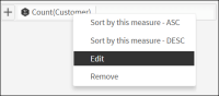
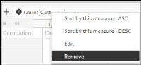
In Figure 4‑40, a default measure, “Count(Customer)”, has been automatically created when the first dimension was set. It appears in the “Measure” field near the top of the window. A Crosstab analysis must contain at least one measure before any calculation can occur. Choosing a measure gives you access to an edit option, as shown in Figure 4‑41.
Figure 4‑41 Measure options
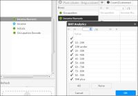
You can also edit the discrete values to be displayed by double-clicking on your chosen rows in the Rows panel, as shown in Figure 4‑42.
Figure 4‑42 Editing discrete values in chosen dimension rows
Your results appeared automatically in the right-hand column as soon as you dragged your dimensions into their designated fields. This happens because “Autocalculate” is set.
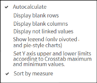
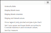
Note: Choosing the “Quick Options”icon in the main Crosstab window gives access to several options when building a Crosstab analysis. They include, among others, the “Autocaclculate” and the “Sort by measure” options. You can save time by turning off the “Autocalculate” option when building a high volume analysis with multiple rows, as shown in Figure 4‑43.
Figure 4‑43 Quick Options list
Using the main viewing tabs in the Crosstab window
In order to be able to take full advantage of this tool, you also need to understand the usage of the Crosstab window view tabs “Table”, “Chart” and “Advanced”.
Table View
This opens when you choose “Crosstab” in the Analytics window (see figure 4.a at the beginning of this chapter). This tab provides you with an area for defining your dimensions (rows and pivot column) and for adding measures and filters. You drag and drop them into the corresponding fields.
At least one measure must be defined to produce an output. The first dimension that you drag into a field sets a “Count” measure for the table to which the dimension belongs.
Chart View
This is a graphic representation of your numeric results. Choose a chart section to send the specific selection information to the Scratchpad. Both Doughnut and Pie charts can be rotated by maintaining a click on them and dragging in the direction you want the chart to rotate.
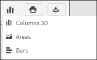
To select the type of chart you want displayed, choose “Chart”.
You can export your chart as an image file by choosing the “Image” icon.
To save it as a PDF file, choose the “Export” icon.
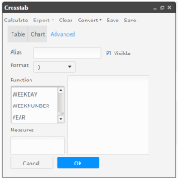
Choosing “Advanced” opens the “Measures” tab. Here you can access three other tabs: Filters, Parametric filters and Options.
Reminder: A measure is an operation that you choose to execute on the values that match the crossing of the fields in the rows and columns. As soon as you choose a field as an axis (setting a dimension or choosing a pivot column), our tool creates a measure using “Count” as the default operator.
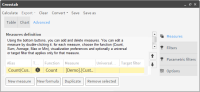
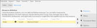
Measures Tab
The “Measures” tab is used for advanced editing/creation and perfecting of the measures used in your Crosstab analysis. Upon opening this tab, you see a table of all the measures that have been set for the current Crosstab. You are also provided with brief instructions for defining measures in this tab, as shown in Figure 4‑44.
Figure 4‑44 Crosstab Advanced Measures tab
Double-clicking on a measure in the Advanced tab opens it in the Measure Creation window, populated with the measure information, ready to be edited. The buttons at the bottom of the Advanced “Measures” tab offer four useful operations that can be performed when creating measures, as shown in .
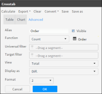
New Measure
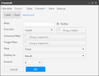
This button opens a window to help you build a new measure, as shown in figure 4.7. In this window you can:
Name your measure in the “Alias” field (mandatory). The following characters cannot be used in a measure name: Double quote, dot, start and end square brackets (“,., [ and ] ).
Choose your basic measure operation from the dropdown list in the functions field: Count, Sum, Average, Max or Min.
Specify the field or table that will be operated on by dragging it from the Data Tree into the “Table” field beside the “Function” field.
Decide what you want displayed using the dropdown list in the “Display as” field: Result, Diff., Index.
Decide how you want the results displayed using the dropdown list in the “View” field: Total, %Total, %Row and %Column.
Select or remove the selection from the “Visible” checkbox, depending on whether or not you want to show the results of your measure calculation in the “Table” view.
Decide the number of decimal points to display using the dropdown list in the “Format” field.
Add universal and target filters if required. Normally, you only filter the measure by a specific category or segment, such as specific group of customers, territory, or type of product.
Save your new measure and go back to the Advanced “measure” tab by choosing “OK”., as shown in Figure 4‑45.
Figure 4‑45 New Measure window in Crosstab
New Formula
This button gives access to a window where you can create more complex calculated measures, based on the ones that you have already created.
Example: You can use the sum of the cost of company operations, divided by the number of operations carried out to obtain an approximation of company costs per type of operation.
In the “New Formula” window, shown in , you can:
Name your measure in the “Alias” field (mandatory). The following characters cannot be used in a measure name: Double quote, dot, start and end square brackets (“,., [ and ] ).
Select or remove the selection for the “Visible” checkbox, depending on whether or not you want to display the results of your measure calculation in the “Table” view.
Decide the number of decimal points to display using the dropdown list in the “Format” field.
Choose the measure you want to operate on by selecting in the “Measures” panel on the left. (All measures that have been defined for this analysis will appear in this panel when you open the “New formula” window).
Choose the advanced measures operation to be added to an existing operation from the sliding list in the functions (operators) field. Formula measures cannot be expressed as Totals. All standard expressions and operations are available such as:
Date and time functions (daysto, age, year, month, secsto, time, datetime...)
Time functions (...)
Text functions (left, right, mid, replace...)
Data type conversion (date, string, integer)
Build complex operations in the main workspace on the right.
Save your new measure formula by choosing “OK”. This also closes the “New formula” window. Click on it again if you have more new operations to add to your measure(s), as shown in Figure 4‑46.
Figure 4‑46 New Formula window
Note: When two integers are divided, the result value is also and integer. If a real result is required, use a real number as a dividend or divisor. For example:
100.0/3
100/3.0
real (100)/3
Duplicate Button
This button makes it possible to create a new measure based on an existing one (selected from the list of measures that appear in the Advanced “Measures” tab. It opens the “New measures” screen with its fields already populated with information concerning the selected measure. Enter the name for the new measure in the “Alias” field.
“Remove selected” Button
Enables you to remove a selected measure from the Crosstab analysis.
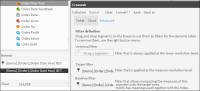
Filters Tab
This tab opens a window used for applying filters to your analysis. Three types of filters are available: Universal, Target and Baseline.
You can also apply a filter to your analysis directly in the main Crosstab workspace by dragging and dropping a filter segment directly into the “Filter” field below the “rows” panel. For multiple or more complex filter additions, you need to use the Filters tab, as shown in Figure 4‑47.
Figure 4‑47 Filters tab in the Crosstab Advanced window
Using Filters
Filters are used throughout BIRT Analytics and are based on data segments. Choosing to use a Universal, Target or Baseline filter will depend on the situation. A Universal filter is applied to a non-pivoted analysis before any change of resolution occurs, whereas a Target filter is applied to a pivoted analysis after a change in resolution occurs.
Target and Baseline filters are used together to create comparative analyses. You must, of course, use segments that can be compared, such as comparing one year with another year or comparing one population group with another.
Understanding resolution change in Crosstabs
When building a Crosstab analysis requiring a change in resolution between dimensions (axes) and the measures in the direction N-to-1, intersection (or crossing) can take place in two different ways:
Type 1 (pivoted): with one variable in Rows and another one in Columns and with resolutions calculated separately before intersection takes place, as shown in Figure 4‑48.
Figure 4‑48 Pivoted crosstab intersection
Type 2 (all fields in rows): with 1 or more variables in Lines and none in columns and where intersection takes place before uploading the resolution, as shown in Figure 4‑49.
Figure 4‑49 All fields in rows intersection
Parametric Filters Tab
This tab makes it possible to apply filters based on interactive selection of parameters when creating a Crosstab. The User interacts directly with the analysis during calculation by supplying values when prompted. Values in normal filters are pre-set before calculation, with no interaction possible.
Note: You can choose to use either a pre-set filter or a prompted parametric filter when cross tabulating, but you cannot use both.
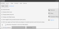
Options Tab
The Options tab gives access to several different possibilities for building or displaying your analyses. Most are self-explanatory. The Autocalculate feature is selected by default. You will often need to turn it off, as shown in Figure 4‑50
Figure 4‑50 Options tab in the Crosstab Advanced view
Sample procedures for creating crosstabs
Our first sample shows you how to create a basic, filtered Crosstab analysis in a few seconds, doing everything in the default “Table” view. The second sample procedure shows you how to quickly create a pivoted Crosstab. The third and fourth procedures show you how to build more complex Crosstabs.
01 - How to create a Crosstab Analysis
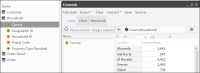
1 Go to the default “Table” view of the Crosstab analysis tool. Click on the Database icon directly above the Data Tree panel. The database symbol, along with the name of the database, appears in the panel. In this case we are using our “Demo” database. Click the symbol to display the available tables in the database. Note: If you do not have access to the Demo database, you can use similar tables from your own company database to create this Crosstab.
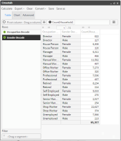
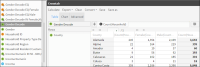
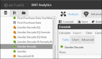
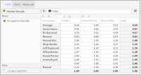
2 Then drag the “Occupation Decode” column from the “Customer” table in the Demo database tree and drop it into the “Rows” panel to start defining dimension rows. Now do the same thing with the “Gender Decode” column, dragging it into the “Rows” panel.
Figure 4‑51 Table view of Crosstab results including Null values
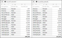
3 See Figure 4‑51. A measure “Count(Customer)” now appears in the measure field in the Table view. It was set automatically when you defined your first dimension row. The measure is applied automatically on the dimension rows and the results are displayed in the main “Table” panel. They are grouped by occupation and gender based on the Customer table.
4 Remove the distracting Null value fields by choosing on “Occupation Decode” in the “Rows” panel to access the window for editing its discrete values. Uncheck the empty field at the top to remove the null values from your calculations and click “Accept”. Do the same thing to remove the null values from the “Gender Decode” dimension.
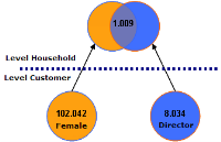
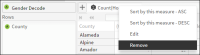
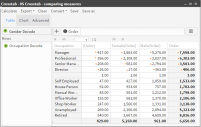
5 Choose the default measure. Then choose “Remove”. While still in the main view, change the measure resolution by dragging the “Household” table from the Data Tree into the measure field where the Count(Customer) measure used to be displayed before we removed it. As the resolution is now “Household”, the results are now based on the “Households” table, as shown in Figure 4‑52. The results are not the same when counting households as they were when counting customers. This shows the importance of resolution changes.
Figure 4‑52 Comparing results
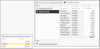
6 Now add a Universal filter to the analysis, (filtering by households with only females living in them) by dragging the “Female” segment from the “Gender Decode” discrete values accessed in the Data Tree and dropping it in the “Filter” field in the “Table” view, as shown in Figure 4‑53. Note: This filter has been applied before the resolution change (at the Customer level).
Figure 4‑53 Adding a Universal filter to the Crosstab analysis
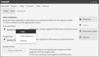
7 This time apply the same filter after the resolution change (at the Household level) by adding a Target filter instead of the Universal filter. Do this by opening the “Filters” tab of the Advanced view and dragging our filter from the “Universal filters” field and dropping it into the “Target filters” field. Finally you need to remove the previously used Universal filter from its field by selecting it and choosing “Clear”, as shown in Figure 4‑54.
Figure 4‑54 Replacing the Universal filter with a Target filter
8 Choose “Calculate” in the Toolbar. Your new results are displayed in the Table view, as shown in Figure 4‑55.
Figure 4‑55 Table results after applying the Target filter
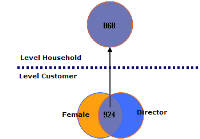
9 These results contain values that did not appear in the previous results where the filtering was done before the resolution change (Universal filter). Here, all the extra values grouped as “Male” represent households with males (having the designated occupation) AND where at least one female lives.
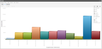
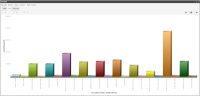
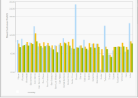
10 Open the “Chart” view to see the graphic display of the results. Figure 4‑56 and Figure 4‑57 shows the graphic results for both filtering situations
Figure 4‑56 Chart view with Universal filter (applied before resolution change
Note: We changed the type of chart display to “Column 3D” by choosing it in the “Chart” icon dropdown list.
Figure 4‑57 Chart view with Target filter (applied after resolution change).
You have now finished your analysis. Several possibilities are available to you, using the Crosstab features, such as saving, exporting or even converting it to another type of analysis.
Note: It is also possible to export a Crosstab analysis directly to the FastDB engine, creating a new table in the database. This is done by selecting the new option “Analytic DB” from the dropdown list of the “Export” tool found in the Crosstab toolbar.
02 - How to create a Pivoted Crosstab Analysis
Make a pivoted Crosstab analysis showing a company’s average profit from customers in each county in California, grouped by gender.
1 Open the main analysis window and choose “Crosstab” to open the Crosstab Table view.
2 Click on the Database icon directly above the Data Tree panel. The database symbol, along with the name of the database, appears in the panel. In this case we are using our “Demo” database. Click the symbol to display the available tables in the database. Note: If you do not have access to the Demo database, you can use similar tables from your own company database to create this Crosstab.
3 Define the first dimension by dragging the “County” column into the Row panel next to the Data Tree. Setting the first dimension row, using a column from the “Household” table, automatically sets a measure on that table with the default Count operator, as shown in Figure 4‑58.
Note: Because the “Autocalculate” option is turned on, the counted Product Group results automatically appear in the main panel of the Crosstab Table view.
Figure 4‑58 Defining a Dimension row
4 Next define the second dimension by dragging the “Gender Decode” column into the “Pivot column” field at the top of the Table view, as shown in Figure 4‑59. Note: Setting the second dimension does not change the default “Count” measure that was set on the “Household” table when we created the “County” dimension row.
Figure 4‑59 Defining a Dimension column (for pivoting)
5 While still in the “Tab” view, eliminate the default measure by selecting it and choosing “Remove” in the dropdown menu that appears. Then click the [+] icon beside the “Measure” field, as shown in Figure 4‑60.
Figure 4‑60 Removing the default measure
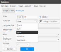
6 In the “New Measures” window that opens, it is mandatory to name your new measure. Because you want to calculate the average profit per customer, type “Mean profit” in the “Alias” field.
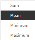
7 Next select the operator you want to use from the dropdown list in the “Function” field. Here you choose “Mean” because you want to calculate average profit, as shown in Figure 4‑61.
Figure 4‑61 Choice of measure operator
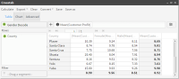
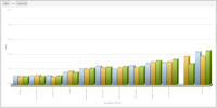
8 The final results appear immediately in the “Table” view. Choose “Chart” to view them graphically. They appear as columns, as shown in Figure 4‑62 and Figure 4‑63.
Figure 4‑62 Table view of results
Figure 4‑63 Chart view of results
9 You have now finished your analysis. Several possibilities are available to you, using the Crosstab features, such as saving, exporting or even converting it to another type of analysis.
Note: It is also possible to export a Crosstab analysis directly to the FastDB engine, creating a new table in the database. This is done by selecting the new option “Analytic DB” from the dropdown list of the “Export” tool found in the Crosstab toolbar.
03 - How to create a Non-Pivoted Crosstab Analysis
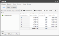
The following steps show you how to create a more complex Crosstab for an international company that enable management to analyze their sales results in southern California. Our Crosstab analysis find the sales figures per product and their average profit from the sale of each product to use these measurements to calculate the total profit by product group in southern California.
1 Open the main analysis window and choose “Crosstab” which opens the Crosstab Table view.
2 Expand the database tables in the Data Tree. Define a dimension row by dragging the “Product Group” column into the Row panel next to the Data Tree. Setting the first dimension row, using a column from the “Order Detail table”, automatically sets a measure on that table with the default Count operator.
Because the “Autocalculate” option is turned on by default, the counted Product Group results appear in the main panel of the Crosstab Table view, as shown in Figure 4‑64.
Figure 4‑64 Creating the first dimension
3 Step 3: Edit the default measure by selecting it in the Measure field and choosing “Edit” in the dropdown list that appears, as shown in Figure 4‑65.
Figure 4‑65 Measure field drop-down Options list
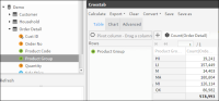
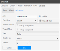
4 The “New Measures” window opens displaying the Count(OrderDetail) measure ready for editing. In this case, change the name (Alias) to “Sales number”. Next choose “OK”, as shown in Figure 4‑66.
Figure 4‑66 New Measure screen
5 Go to the default Measures screen in the “Advanced” view tab. It now displays your first measure with its new name “Sales number”. Choose “New Measure” at the bottom of the Measures tab to open the New Measures screen again, ready for you to add your second measure to the analysis, as shown in Figure 4‑67.
Figure 4‑67 New Measure button
6 Our second measure will be used to calculate the average profit from the sale of each product. Start by naming the measure “Average profit”. Then select the “MEAN” operator in the “Function” field, as shown in Figure 4‑68.
Figure 4‑68 Creating a measure
7 “Drag a column” appears, shown in Figure 4‑68, asking you to drag the column to be operated on by the measure into the field next to the Function field. Drag the “Line profit” column, from the “Order Detail” table in the Data Tree, into the “Drag a column” field, as shown in Figure 4‑69.
Figure 4‑69 Setting the second measure in “Drag a column” field
8 Complete your measure by setting the number of decimal places to “2” in the “Format” field (near the bottom of the window) and click “OK” to save your measure and go back to the Measures tab in the Advanced view.
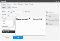
9 Back in the Measures tab, where both your measures are now displayed, select the Mean profit measure and choose “New Formula”.
10 In the formula window that opens you will need to create a further calculation formula for your analysis (based on the Mean profit measure that you have created). This is necessary to be able to obtain the total profit results. Name your formula “Total profit”.
11 Drag the “sales number” measure from the “Measures” field into the blank work area located on the right of the measures box, followed immediately by the “Mean profit” measure. Now place the multiplication symbol ”*” between the two measures being careful to stay outside of the brackets: [sales number]*[Mean profit], as shown in Figure 4‑70.
Figure 4‑70 New Formula window
12 Set the “Format” field to “2” decimal places and click “OK” to save the calculated measure and to return to the Advanced view of your Crosstab.
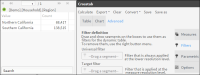
13 Back in the “Advanced” view, open the “Filters” tab. Here you must drag the segment “Southern California” in to the “Universal” filter field, as shown in Figure 4‑71. Note: You obtain the desired segment in the Data Tree by opening the discrete values of the “Region” column located in the “Household” table of the “Demo” database.
Figure 4‑71 Creating a Universal filter
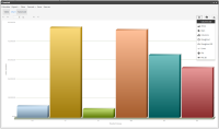
14 Click “OK” to save your filter. Go back to the Crosstab “Table” view to see your completed Crosstab analysis as a table or open the Chart view to see it graphically displayed, as shown in Figure 4‑72 and Figure 4‑73.
Figure 4‑72 Table view of results
Figure 4‑73 Chart view of results
You have now finished your analysis. Several possibilities are available to you, using the Crosstab features, such as saving, exporting or even converting it to another type of analysis.
Note: It is also possible to export a Crosstab analysis directly to the FastDB engine, creating a new table in the database. This is done by selecting the new option “Analytic DB” from the dropdown list of the “Export” tool found in the Crosstab toolbar.
04 - How to make Comparisons using a Crosstab Analysis
Here you build a crosstab analysis to determine a purchasing trend based on the difference between the number of orders placed in 2003 and 2004 crossed by occupation and gender.
1 Go to the main window of the Analysis “Crosstabs” tool. Click the “Options” icon on the upper right and uncheck the “Autocalculate” box, shown below in Figure 4‑74.
Figure 4‑74 Autocalulate option (de-activated)
2 Create the first dimension by dragging the “Gender Decode” column (in the customer table) into the pivot column field, as shown below in Figure 4‑75.
Figure 4‑75 Setting the first dimension - Pivot column (Y-axis)
3 Create a second dimension by dragging the “Occupation Decode” column into the rows panel, as shown below in Figure 4‑76.
Figure 4‑76 Setting the second dimension - Dimension Row (X-axis)
4 Remove the default measure “Count(Customer)” that was created when setting the first dimension. Click on it and choose “remove” from the dropdown list that appears, as shown below in Figure 4‑77.
Figure 4‑77 Removing the default measure
5 While still in the main “Table” view window, choose the [+] icon next to the measure field to create a new measure in the “Advanced” tab “New measure” window that opens, as shown in Figure 4‑78. In this case the fields are already populated for the new measure to be created in the next 4 steps.
Figure 4‑78 New Measure window with defined “Order” measure
6 Enter the measure name “Order” in the “Alias” field (mandatory field). Next drag the “Order” table into the field next to the “Alias”.(This changes the resolution of the measure compared to the previous measure).
7 Click on the arrow in the “Display as” field and choose “Diff” in the dropdown list that appears. Note: This will display the difference in size (in units) between the Base and Target filters that we are soon going to create.
8 Click “OK” to save your measure. This opens the “Advanced’ view tab that now displays your new measure, as shown in Figure 4‑79.
Figure 4‑79 Advanced view Measures tab
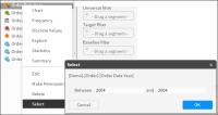
9 Now choose the “Filters” tab. This opens the “Filter definition” window, as shown in Figure 4‑80. Note: Defining filters requires finding or creating the necessary segments to be dragged into the chosen “Filter” fields in the “Filter definition” window. In this case use the “Range selection” tool to create 2 segments – one for 2003 and the other for 2004.
Figure 4‑80 Filter Definition window
10 Make a right-click the “Order Date Year” column in the “Order” table and choose “Select” in the dropdown list that opens. This opens the “Select” window where you can specify ranges based on years.
Set the range in this window to go from “Between” 2004 “and” 2004, as shown above. Choose “OK” to close the “Selection” window and send the new range segment (year 2004) into the Scratchpad, as shown in Figure 4‑81.
Figure 4‑81 Preparing filter segments using the “Select” ranges tool
11 Drag this segment (year 2004) from the Scratchpad into the “Target” filter field in the “Filter creation” window, as shown in Figure 4‑82.
Figure 4‑82 Dragging the year segments into the corresponding filter fields
12 Repeat the operations done in steps 10 and 11 to create your Base filter. This time setting your range from “Between” 2003 “and” 2003. Then click “OK” to close the window and send the new range segment to the Scratchpad.
13 Drag this second segment (year 2003) into the “Base” filter field in the “Filter definition window. (See Figure 4‑82).
14 Now that both filters have been specified, click “Calculate” in the toolbar at the top of the window. The results are now displayed in the Table view, as shown in Figure 4‑83.
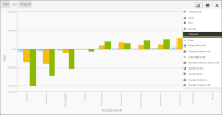
Note: There are several negative results. A negative result indicates a reduction in orders placed in 2004 (Target filter) compared with orders placed in 2003 (Base filter).
Figure 4‑83 Table view of your calculated analysis
15 Choose the “Chart” view to see a graphic display of the results, shown as columns. If you want the results displayed in a different type of chart, click the “Charts” icon and choose your chart in the dropdown list, as shown in Figure 4‑84.
Figure 4‑84 Chart view of your analysis
16 You have now finished your analysis. Several possibilities are available to you, using the Crosstab features, such as saving, exporting or even converting it to another type of analysis.
Note: It is also possible to export a Crosstab analysis directly to the FastDB engine, creating a new table in the database. This is done by selecting the new option “Analytic DB” from the dropdown list of the “Export” tool found in the Crosstab toolbar.
05 - How to change the type of analysis results to be displayed
You can change the way your information is displayed in an analysis by changing the “Result” parameter in a defined measure.
1 Open the Crosstab analysis that you have created above and click the defined measure in the “Measure” field in the Crosstab “Table” view and choose “Edit” from the dropdown list. This opens the measure in the “Measures definition” window.
2 Click on the “Result” box at the bottom and choose “Index” from the dropdown list that appears. This will display the difference between the compared groups. (Target/Total) / (Baseline/Total).
3 Choose “OK”. Then choose “Calculate” in the toolbar at the top of the window. This opens the “Table” view where your results are now displayed very differently with no negative values, ash shown in Figure 4‑85.
Figure 4‑85 New Table results with no negative values
4 Go back to the Chart view and choose the chart icon to enable 3D columns for your display, as shown in Figure 4‑86 and Figure 4‑87. Your chart appears as a 3D column display.
Note: The way the results are displayed now, values > 1.0 indicate that more orders were placed in 2004 than in 2003.
Figure 4‑86 Choosing your Chart display
Figure 4‑87 New 3D column Chart display of your analysis results