A Pareto analysis represents Pareto’s 80-20 theory with available data. Pareto’s theory states that:
A minority of the population (approximately 20%) bears 80% of something.
The remaining majority group (approximately 80%) bears 20% of something.
For example:
20% of clients are responsible for 80% of turnover.
80% of turnover comes from 20% of the product catalog.
You can use this theory to explore the relationship between a numerical and a categorical variable. For example, you can analyze the accrued benefit of customers (continuous numerical variable) through the grouping of customer’s accrued benefit into deciles (categorical variable).
How to create a Pareto analysis
1 In Analytics—Analysis, choose Pareto.
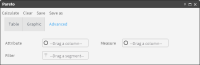
2 In Pareto, choose Advanced, as shown in Figure 4‑121.
Figure 4‑121 Pareto—Advanced
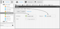
3 Drag a categorical field from Data Tree to Attribute.
4 Drag a related numeric field from Data Tree to Measure. The resulting entries are shown in Figure 4‑122.
Figure 4‑122 Dragging an attribute and a measure to Pareto
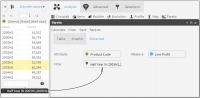
5 Add a filter to limit the results, if necessary. Drag a segment from Discrete Values or Scratchpad to Filter, as shown in Figure 4‑123.
Figure 4‑123 Dragging a filter to Pareto
6 Choose Calculate.
7 Examine the results on Graphic.
For example, select a numeric field as a measure, and a quantile rank of the same field as an attribute. This quantile groups its values into n equal groups. The analysis displays a Pareto curve. You can see if the Pareto analysis satisfies Pareto’s theory by looking at the growth curve. The chart shows cumulative percentages.
Table shows, sorted by the amount, the records, both amount and percentages, cumulative and cumulative percentages.
Double-clicking Count (record number), the records appear in Scratchpad. By choosing the Cumulative Count value, you can display the record and all previous records.