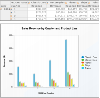
Because a chart presents a picture, it reveals trends that are not as apparent if a cross tab presents the same data.
Figure 6‑1 shows an example of a cross tab and a column chart displaying sales revenue data. The chart shows instantly the sales trend for the year without your having to look at the numbers.
In a cross tab that contains hierarchical data, use Data Analyzer to drill down to view the most detailed data. Then, display the cross tab data as a chart. Data Analyzer supports editing the chart to display any hierarchy level you want to analyze. For example, after expanding the cross tab in
Figure 6‑1 to display the year, quarter, and month levels, you can display the data in a chart and edit the chart to display the summary values for 2004, quarterly values, or the detail values for the twelve months of 2004.