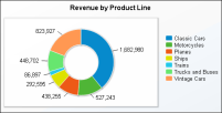
Similar to a pie chart, a doughnut chart is a circular chart divided into sectors or slices. Each sector represents a value that is proportional to the sum of the values. Use a doughnut chart when you want to show the relationship of parts to the whole, for example, the amount each quarter’s revenue contributes to a company’s total annual revenue, as shown in
Figure 6‑13.