Selecting data for a doughnut or pie chart
To customize a doughnut or pie chart, you can change the following values using Chart Builder—Data.
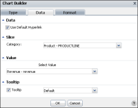
Figure 6‑25 displays values for a chart using the cross tab values in the sample report document, Crosstab Sample Revenue.rptdocument.
Figure 6‑25 Specifying data values in Chart Builder—Data

In Data, you can select Use Default Hyperlink if it is available. If you select this option, you can hover the pointer over a legend item to highlight a corresponding item in the chart.
In Slice:
From the items in the list, select which category to display as a slice, or segment, of the pie chart. For example, the sample chart can display revenue values for the 12 months of the year, the 4 quarters of the year, the entire year, or for each product line.
Figure 6‑25 displays the selection of Product - PRODUCTLINE.
In Value:
For Select Value, select a value. For the sample chart, only Revenue ‑ revenue value is available.
In Tooltip:
From the available items in the list, select which value to display in a tooltip when you hover the pointer over an item in the chart. In the sample chart, for example, the default values that appear when the pointer hovers over a chart column are the category name and data value. You can change the value to a different value, such as Category Data, Value Series Name, or Value Data.