Selecting a data series using a context menu
For a cross tab that displays more than one data series on the
y-axis, Data Analyzer enables you to easily select a series to display on the
y-axis. For example,
Figure 6‑26 shows a cross tab that displays revenue and customer count data series in columns.
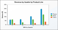
Figure 6‑27 displays the revenue data series by quarter in a chart.
Figure 6‑26 Displaying two data series in a cross tab
Figure 6‑27 Displaying the revenue data series by quarter in a chart
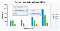
To select a different data series to display in the chart, right-click the chart to view the available data series. For example,
Figure 6‑28 shows selecting the customer count data series.
Figure 6‑28 Choosing to display the CustomerCount data series in a chart
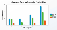
Figure 6‑29 shows the chart displaying the customer count data series.
Figure 6‑29 Displaying the customer count data series in a chart