How to format a chart
1 While viewing a chart in Data Analyzer, right-click the chart area, and choose Edit.
2 In Chart Builder—Data, choose Format.
3 In Chart Builder—Format, specify the titles and options, then choose OK.
For example,
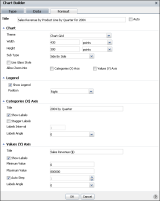
Figure 6‑34 shows format selections for a sample bar chart. Notice for this chart, the Categories (
X Axis) Title appears on the vertical axis on the left, and the Values (
Y Axis) Title appears on the horizontal axis at the bottom, which are reversed from the positions for a column chart.
Figure 6‑34 Selecting data on Chart Builder—Format
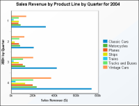
The chart updates, reflecting your changes.
Figure 6‑35 shows a bar chart with the formatting applied.
Figure 6‑35 Viewing a formatted bar chart