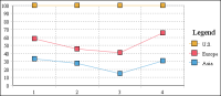
In a percent stacked line chart, multiple series are stacked vertically and the values are shown as a percentage of the whole. As shown in
Figure 8‑19, the sales values appear in percentages instead of numbers. Like the percent stacked area chart, the percent stacked line chart makes sense only when displaying and comparing multiple series. Do not use this chart subtype if you are displaying only one series, for example, only sales for Europe.