Selecting data for a pie chart
Unlike other chart types, a pie chart can display only one value series. For example, a pie chart can show sales totals by product line, but it cannot show sales totals and profit totals by product line. This section shows examples of selecting and organizing data for pie charts. Each example shows the following items:

The pie chart
The table data on which the chart is based
The selections made in Chart—Data
Example 1
The pie chart in
Figure 8‑38 shows sales by quarter.
Figure 8‑38 A pie chart showing sales by quarter
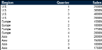
Figure 8‑39 shows the table data that the pie chart uses.
Figure 8‑39 The table data used by the chart in
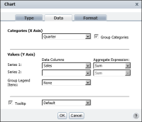
Figure 8‑38 Figure 8‑40 shows how the data is selected for the chart. The Quarter column is the category series, and the Sales column is the value series. In addition, the data is grouped by quarter, and the Sum function calculates the grand total of the sales, across regions, for each quarter.
Figure 8‑40 The data selected for the chart in
Figure 8‑38 Example 2
Figure 8‑41 shows a series of pie charts. Each pie chart shows the sales by quarter for a particular region, such as the United States, Europe, and Asia.
Figure 8‑41 A series of pie charts showing sales by quarter and by regions
Figure 8‑42 shows the table data that the series of pie charts use. It is the same set of data used in the previous pie chart example.
Figure 8‑42 The table data used by the charts in
Figure 8‑41 Figure 8‑43 shows how the data is selected for the chart. The Quarter column is the category series and the Sales column is the value series.
Figure 8‑43 The data selected for the charts in
Figure 8‑41 Unlike the previous pie chart example, the category series (quarter) values are not grouped. Instead, the value series data is grouped by the region column.
Example 3
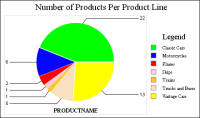
The pie chart in
Figure 8‑44 shows the number of products in each product line.
Figure 8‑44 A pie chart showing the number of products in each product line
Figure 8‑45 shows a sample of the table data that the pie chart uses. The actual data spans two pages.
Figure 8‑45 The table data used by the chart in
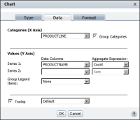
Figure 8‑44 Figure 8‑46 shows how the data is selected for the chart. The PRODUCTLINE column is the category series, and the PRODUCTNAME column is the value series. In addition, the data is grouped by product line, and the Count function counts the number of products in each product line.
Figure 8‑46 The data selected for the chart in
Figure 8‑44