Selecting data for a scatter chart
A scatter chart displays data as x‑y coordinates. It combines each pair of numeric values into single data points. You select columns that contain numeric values for both the category and the value series. This section shows examples of selecting and organizing data for scatter charts. Each example shows the following items:

The scatter chart
The table data on which the chart is based
The selections made in Chart—Data
Example 1
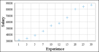
The scatter chart in
Figure 8‑50 shows the relationship between salaries and years of experience.
Figure 8‑50 A scatter chart showing the relationship between salaries and years of experience
Figure 8‑51 shows the table that contains the data that the scatter chart uses. The chart uses data from the Years_Experience and Average Salary columns.
Figure 8‑51 The table data used by the chart in
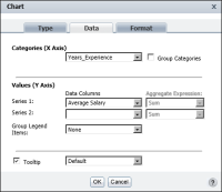
Figure 8‑50 Figure 8‑52 shows how the data is selected for the chart.
Figure 8‑52 The data selected for the chart in
Figure 8‑50 The Years_Experience column is the category series, and the Average Salary column is the value series. The data is neither grouped nor aggregated, because the scatter chart plots every value in the Years_Experience and Average Salary columns.
Example 2
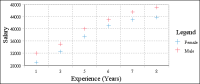
Like the scatter chart in the previous example, the scatter chart in
Figure 8‑53 shows the relationship between salaries and years of experience. In this example, however, the chart displays two value series: the average salaries for men and the average salaries for women.
Figure 8‑54 shows the table containing the data that the scatter chart uses. Unlike the table in the previous scatter chart example, this table does not show the average salaries by years of experience or by gender. Instead, this table shows salary and experience data for each employee. To display the average salaries by years of experience and by gender, the data must be grouped and aggregated.
Figure 8‑53 A scatter chart showing the relationship between salaries and years of experience, by gender
Figure 8‑54 The table data used by the chart in
Figure 8‑53 Figure 8‑55 shows how the data is selected, grouped, and aggregated for the chart. The Years_Experience column is the category series and the Salary column is the value series. The values are grouped by years of experience and gender. The Average aggregate function is selected, so that the chart calculates and displays the average salary for each group.
Figure 8‑55 The data selected for the chart in
Figure 8‑53