Organizing data in groups
As the previous section describes, sorting data makes a report more readable and useful. Sorting, however, is only one of the ways to organize data in a report. It is common for reports to present data that is organized into meaningful groups, especially reports that contain large amounts of data.
Consider the task of listing every item a corporation owns, along with information such as the category, purchase price, purchase date, inventory code, location, and supplier. If a report presents all these items in an unorganized list or even in a sorted list, there is no way to determine how much the corporation has spent, for example, on office furniture or computer hardware, because this information cannot be calculated. The report cannot help you see which year had the most purchases, nor is it easy to tell which items are located in a field office and which items are in the warehouse.
To organize this information into a useful inventory report, you create data groups. Data groups contain related data rows. For example, you can create a report that lists items by category—all office furniture in one group, all computer hardware in another group, all computer software in a third group, and so on. For each group, you can calculate aggregate data, such as the total purchase price or the count of items in a group. Organizing data in groups makes it easier to compare and analyze information.
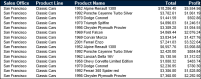
Compare the reports in
Figure 4‑6 and
Figure 4‑7. The report design in
Figure 4‑6 displays sales information in a simple list. The data rows are sorted by sales office, then by product line. Notice the repeated sales office name and product lines.
Figure 4‑6 Displaying data in a simple list
Figure 4‑7 A report design displaying data grouped by sales office and product line
The report design in
Figure 4‑7 shows the same data. Unlike the report design in
Figure 4‑6, this design groups the rows by sales office then by product line. Data appears in a hierarchy. The report design does not contain repeated values for office names and product lines. In addition, totals, displayed in italics, appear at the end of each product line and sales office group.
As the example reports
Figure 4‑6 and
Figure 4‑7 show, a report design that groups data provides a more effective way to view data. When you group data, you can:

Add subtotals, counts, averages, or other aggregate information at the beginning or end of each group.
Insert a page break before or after each group to start each group of data on a new page.
Hide the details of each group to view a summary report.
In addition, BIRT Studio completes the following actions when you group data:
Removes duplicate values.
Sorts the values of each group. For example, a product line group displays the product lines in alphabetical order (Classic Cars to Vintage Cars), as shown in
Figure 4‑7.
Generates a table of contents when you view the finished report in the viewer. The table of contents, which displays the group values, supports navigating to specific locations in the report. This feature is particularly useful when a report contains many pages.