About data selection gadgets
Data selection gadgets enable users to filter data displayed in gadgets. These gadgets present the user with values taken from BIRT data objects. Other gadgets, such as data visualization and report gadgets, link to data selection gadgets to enable user choices to filter data. Dashboard developers can filter, format, and sort values that display in data selection gadgets.
A Show Selections gadget is available from the dashboard menu to display and clear selected values on the dashboard.
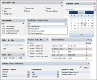
Figure 4‑105 shows the different data selection gadgets.
Figure 4‑105 Displaying data selection gadgets
Table 4‑6 describes the data selection gadgets available to use in a dashboard.
Table 4‑6 Data selection gadget types
Icon | Type | Purpose |
| Calendar | Calendar gadgets display data from a data object as a calendar where a user can select day, month, or year. Users can select a single value. |
| Check box | Check box gadgets display data from a data object with a check box next to each value. Users can select multiple values. |
| Combo box | Combo box gadgets display data from a data object in a drop‑down box. This gadget supports manual typing and autosuggestion of values. |
| Data version | Data version gadgets display available versions of BIRT data stores for a user to choose. Changing a data store version updates all gadgets using the data store. |
| List | List gadgets display data object values in rows. Users can search and select multiple values. Press Ctrl while selecting a value range; press Shift while selecting multiple values. |
| Radio button | Radio button gadgets display data from a data object with a radio button next to each value. Users can select a single value to include. |
| Selector group | Selector group gadgets enable cascading user selections from a data object. Users select from multiple values and apply their final selection. |
| Slider | Slider gadgets display data from a data object as a sliding bar with tick marks next to known values. This gadget supports multivalue selections. |
The calendar and slider can optionally be used without binding to a BIRT data object. Dashboard developers can set fixed values in these gadgets.
Gadgets that link to a data selection gadget filter data according to the configuration of the data selection gadget. The available filter operators used by data selection gadgets are shown in
Table 4‑7.
Table 4‑7 Operators used by data selection gadgets
Operator | Calendar | Check box | Combo Box | List | Radio | Slider |
Any of | | ✓ | | ✓ | | |
Between | | | | | | ✓ |
Equal to | ✓ | | ✓ | ✓ | ✓ | ✓ |
Greater than | ✓ | | | | | ✓ |
Greater than or equal to | ✓ | | | | | ✓ |
Less than | ✓ | | | | | ✓ |
Less than or equal to | ✓ | | | | | ✓ |
Dashboard developers can select which operator to use in calendar and slider gadgets.
Multiple data selection gadgets can be linked to each other to enable users to select detailed information. For example, a list gadget showing customer names and a list gadget showing order numbers can be linked together. When a user selects a customer name, the customer’s order numbers appear in the list gadget showing order numbers.
Dashboard developers link a report gadget to the list gadget showing order numbers, causing the report gadget to show data about the selected order.
For more information about linking gadgets, see
About linking gadgets together.

