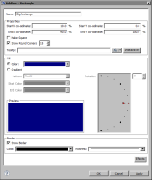


Property | Object Type | Usage |
Center X coordinate | Polygon, Circle, Arc | Specifies the location, as a percentage of the size of the gadget, of the x coordinate of the object. |
Center Y Coordinate | Polygon, Circle, Arc | Specifies the location, as a percentage of the size of the gadget, of the y coordinate of the object. |
Color | Line, Text | Specifies the color of the line. |
Dash Gap | Line | Specifies the length of gaps between dashes, in pixels. |
Dash Length | Line | Specifies the length of dashes, in pixels. |
End Angle | Circle, Arc | Specifies the end angle of the object. |
End Color | Rectangle, Polygon, Circle, Arc | Specifies the end color of the gradient fill. |
End X coordinate | Rectangle | Specifies the location, as a percentage of the size of the gadget, of the end x value of the object. |
End Y coordinate | Rectangle | Specifies the location, as a percentage of the size of the gadget, of the end y value of the object. |
Font | Text | Specifies the font for the object. You can also select Bold, Italic, or Underline. |
Font Size | Text | Specifies the font size in points. |
Horizontal | Text | Supports the selection of horizontal text alignment within the gadget. |
Inner Radius | Arc | Specifies the radius of the inner portion of the object, as a percent of the size of the gadget. |
Gradient | Rectangle, Polygon, Circle, Arc | Select to have a gradient type of fill. Choose a Radial or Linear pattern. |
Label | Text | Specifies the text that appears on the object. |
Name | All | Specifies the name of the object. This name appears in the list on AddOns options. |
Outer Radius | Arc | Specifies the radius of the outer portion of the object, as a percent of the size of the gadget. |
Radius | Circle | Specifies the radius, as a percent of the gadget, of the object. |
Rotation | Rectangle, Polygon, Circle, Arc | Specifies the rotation angle for the fill within the object. |
Rotation Angle | Polygon | Specifies the rotation angle of the object. |
Scale Image | Image | Enables or disables image scaling. Adjust the height and width of the image by percent. |
Scale This Font | Text | Select to alter the size of the text. Adjust the scaling amount for width and height by percent. |
Show as Dashed | Line | Enables or disables dashed lines. |
Show Border | Rectangle, Polygon, Circle, Arc | Enables or disables the drawing of a border line around the object. Select the color and thickness of the border with the Color and Thickness drop‑down menus. |
Show Round Corners | Rectangle | Enables or disables rounded corners. Type the percent of a circle to round the corner. |
Sides | Polygon | Specifies the number of sides on the object. |
Size | Polygon | Specifies the size, as a percent of the gadget, of the object. |
Solid Color | Rectangle, Polygon, Circle, Arc | Select to use a solid fill color for the object. Select a color from the associated drop-down list box. |
Start Angle | Circle, Arc | Specifies the beginning angle of the object. |
Start Color | Rectangle, Polygon, Circle, Arc | Specifies the start color of the gradient fill. |
Start X coordinate | Rectangle | Specifies the location, as a percentage of the size of the gadget, of the beginning x value of the object. |
Start Y coordinate | Rectangle | Specifies the location, as a percentage of the size of the gadget, of the beginning y value of the object. |
TextBox Background Color | Text | Specifies the background color of the text box. |
TextBox Border Color | Text | Sets the border color of the text box. |
Text Wrap | Text | Disables or enables text wrap. Choose, by percent of the gadget, the maximum height and width for the wrap. |
Thickness | Line | Specifies the thickness of the line. |
Transparent | Image | Specifies the amount of transparency, in percent, of the image. |
URL | Image | Specifies the location of the image for AddOn file types of .gif, .jpg, .png, or .swf. |
Vertical | Text | Supports the selection of vertical text alignment within the gadget. |