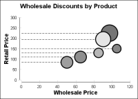
Adding acceleration lines to bubble charts emphasizes their
y-axis value, as shown by the dashed lines in
Figure 17‑6. You can also add various styles and colors of lines around the bubbles. In
Figure 17‑6, a thick black line around the bubbles makes them stand out.
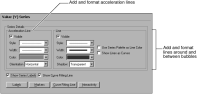
To change these colors and styles, navigate to the Value (Y) Series section of Format Chart. Use Series Details to add and format acceleration lines, or to add lines around the bubbles, as shown in
Figure 17‑7.