Formatting a difference chart
Difference charts use fill areas to highlight differences in data. The chart can display positive differences in one color and negative differences in another. For example, use a difference chart to show how sales compare to quota over a period of time, where positive values represent sales in excess of quota and negative values represent sales below quota.
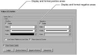
To show positive and negative differences, navigate to the Value (Y) Series section of Format Chart. Use Value (Y) Series to display and format positive and negative areas on the difference chart, as shown in
Figure 17‑8.
Figure 17‑8 Displaying positive and negative fills on a difference chart