Formatting a meter chart
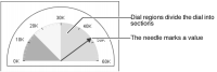
When you format a meter chart series, you work with the chart elements shown in
Figure 17‑10.
Figure 17‑10 Elements of a meter chart
You can modify the following meter chart attributes:

Dial size. Determine the size of the dial’s radius as a proportion of the meter. Use start- and stop-angle settings to specify the portion of a complete circle that the meter comprises.
Dial scale and tick marks. Set the range of values and the number or interval settings of tick marks.
Dial-region size, color, and placement.
Needle formats. Modify the style and width of the needle and its pointer.
Multiple meter placement. If a chart uses multiple meters to present data, you can arrange the meters in rows or columns.
Label settings. Show or hide labels for regions and for the chart data point.
Working with the dial size
To change the distance between the center of the chart and the outside of the dial, you change the dial radius. Use percentage settings to size the dial relative to the meter. For example, a setting of 50 creates a dial radius that is half the distance from the center of the meter to its outer boundary. In a chart that uses more than one value-series definition, you set a single dial radius that applies to all series. If different series contain different dial radius values, the dial uses the larger value.
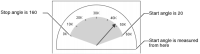
To change the shape of a dial, you change the start- and stop-angle settings. The angles are measured counter-clockwise from the right. For example, in
Figure 17‑11, the dial uses a start setting of 20 and a stop setting of 160.
Figure 17‑11 Start- and stop-angle settings in a semicircular meter
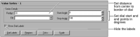
To set the size of a dial, navigate to the Value Series section of Format Chart. Use the Series Details to set or modify the dial size, as shown in
Figure 17‑12. You can also hide the dial labels using this page.
Figure 17‑12 Dial size and label visibility settings
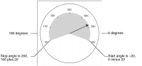
The start and stop settings of the dial affect the style of the meter. If both angle settings are between 0 and 180, the chart displays a half-circle. If either angle setting is less than 0 degrees or greater than 180 degrees, the chart displays a full circle. For example, the chart shown in
Figure 17‑13 uses a start angle of –20 and a stop angle of 200. The first value in the dial, 0, appears at 200 degrees, and the last, 60K, appears at –20 degrees.
Figure 17‑13 Start- and stop-angle settings in a full meter and full dial
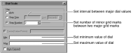
Working with the dial scale and tick marks
The chart builder uses the available data to set a span for the dial, then it places tick marks at appropriate intervals. The dial scale defines the range of data values that the meter displays. To change the scale of a dial, navigate to the Value Series section of Format Chart, then choose Scale. Use the Scale settings to change the range or spacing of the data the dial displays, as shown in
Figure 17‑14.
Figure 17‑14 Dial scale options
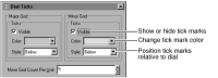
To modify the tick marks on a dial, navigate to the Value Series section of Format Chart, then choose Ticks. Use the settings to modify the major or minor grid ticks, as shown in
Figure 17‑15.
Figure 17‑15 Dial tick mark options
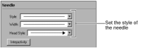
Working with needle formats
You can change the line style, width, and head style of a needle. Navigate to the Value Series section of Format Chart, then choose Needle to modify the needle appearance, as shown in
Figure 17‑16.
Figure 17‑16 Needle style options
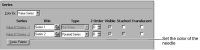
To change the color of a needle, select Series Palette, as shown in
Figure 17‑17.
Figure 17‑17 Changing needle color
Working with multiple meters
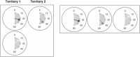
In a chart with multiple meters, you can position the meters by specifying how many columns to use to display them. For example, to use three meters to contrast the performance of two managers in one territory and one manager in another territory, specify a two‑column grid. Using two columns for three meters produces the chart shown on the left in
Figure 17‑18. To arrange the meters horizontally, as shown on the right, specify three columns.
Figure 17‑18 Using two- and three-column grids in a meter chart
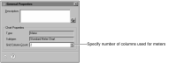
To lay out the meters, navigate to the Chart Area section of Format Chart, then choose General Properties. In Grid Column Count, select the number of columns the chart uses to display the meters, as shown in
Figure 17‑19.
Figure 17‑19 Grid Column Count option
Specifying a grid column count of 1 arranges multiple meters vertically. Specifying a grid column count equal to the number of meters arranges the meters horizontally.
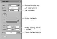
Working with meter chart labels
To format the labels that identify points on the dial, navigate to the Value Series section of Format Chart and choose Dial Labels. Use the settings shown in
Figure 17‑20 to format, outline, or pad the labels.
Figure 17‑20 Dial label options
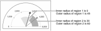
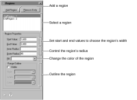
Working with dial regions
To highlight the values on the dial, you use dial regions. Dial regions are similar to axis markers. You determine a start and an end value for each region. After you set up the regions, you can change the region color or outline. If regions overlap, the last region that you create takes precedence in formatting. You can also set the inner and outer radius of a region to specify the part of the dial showing the region’s color. For example,
Figure 17‑21 shows a chart with two regions. The region on the left has an outer radius of 45. The region on the right has an inner radius of 30 and an outer radius of 60.
Figure 17‑21 Regions in a dial
To add and format a dial region, navigate to the Value Series section of Format Chart, then choose Regions to use the options shown in
Figure 17‑22. To control the region’s radius, set the distance from center of dial to the inner and outer edge of region.
Figure 17‑22 Formatting regions