Formatting a pie chart
You can modify the following characteristics of pie charts:

Aspect ratio and rotation
Change the aspect ratio to make a pie chart oval, and rotate the chart.
Color and outline
Select color and outline settings for each pie slice.
Distance between pie slices
Separate one or more slices of the pie from the rest of the chart.
Leader lines
Modify the appearance of leader lines or hide them.
Presentation of multiple and grouped pie charts
Improve the appearance of multiple pie charts by specifying a uniform size for individual pie charts. Arrange grouped pie charts in rows or columns.
Working with aspect ratio and rotation
Changing the aspect ratio of a pie chart makes it oval rather than circular, as shown in
Figure 17‑23. Rotating a pie chart changes the position of the slices.
Figure 17‑23 Pie chart displayed as a circle and an oval rotated 90 degrees
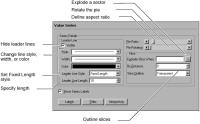
To modify aspect ratio or rotation, navigate to the Value Series section of Format Chart, shown in
Figure 17‑24.
Figure 17‑24 Formatting a pie chart
By default, Pie Ratio is set to an aspect ratio of 1, creating a circle. To create an oval, scroll to a higher or lower aspect ratio. An aspect ratio greater than 1 results in a vertically stretched oval, and an aspect ratio less than 1 creates a horizontally stretched oval. To rotate the chart, in Pie Rotation, scroll from a default value of 0.0 to the degrees by which to rotate the chart. The chart rotates in a counter-clockwise direction.
Working with leader lines
As shown in
Figure 17‑24, the line style, width, and color of leader lines can be modified in the same way as the formatting attributes of other lines in a chart. To specify the same length for all leader lines, select the leader-line style, Fixed Length. To hide the leader lines, deselect Visible.
Working with pie slices
You can outline each slice and change the outline properties. You can also select a color palette for the sectors. To outline pie-chart slices, navigate to the Value Series section of Format Chart, then use Slice Outline to select an outline color, as shown in
Figure 17‑24. You can also set the percentage of the plot area used to render the pie slices.
You can set a minimum value for pie slices. A slice with a value equal to or greater than the minimum appears as usual. Slices with values below the minimum are combined in a new remainders slice. You can create a label for the remainders slice to display in the legend.
You can set the minimum as a static value or as a percentage of the pie value. For example, you can show sales totals for a group of customers and combine customers with sales below $1,000,000.00 in a sector called Infrequent Orders, or you can combine customers with sales below two percent of the total sales.
To specify a minimum slice size, navigate to the Category Series section of Format Chart, then set up a minimum slice size equal to either a value related to slice size or to a percentage of the pie, as shown in
Figure 17‑25.
Figure 17‑25 Minimum slice settings
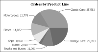
Exploding pie slices
By default, pie slices are not offset from the chart. Slices appear joined to one another at the center of the chart, and leader lines connect slices and data labels, as shown in
Figure 17‑26.
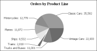
To emphasize a slice, explode it. This action offsets the slice from the rest of the chart, as shown in
Figure 17‑27.
Figure 17‑26 Using default formatting settings
First, decide which slices to explode. To explode all pie slices, specify the offset in By Distance. To explode specific pie slices, create an expression. For example, create an expression to explode only the slices that represent total orders under $3000.
Figure 17‑27 Exploding the Trains slice
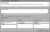
Navigate to the Value Series section of Format Chart. In Explode Slice When, open Expression Builder. Expression Builder includes a Variables category to facilitate creating the expression, as shown in
Figure 17‑28.
Use the Variables category to add variables, such as Value Data or Category Data, to the expression. For example, use the following expression to explode slices that have a value of less than 3000:
valueData<3000
In By Distance, provide the offset. For example, a value of 25 offsets exploded slices by twenty-five percent of the size of the original pie.
Arranging multiple pies
When you create a report that contains multiple pie charts, enhance the appearance of the report by making the pies a uniform size. Double-click one of the pie charts to open the chart builder. Navigate to the Chart Area section of Format Chart. In Coverage, type 50 to specify that the pie cover 50 percent of the plotting area. Preview the report and compare the size of the pie you scaled to others in the report. Experiment using different values until you find the value that makes the pies a uniform size.
Figure 17‑28 Building an expression to explode a pie slice
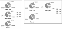
When you create a single chart that uses multiple pies, you can specify how many columns to use to display them. For example, in
Figure 17‑29, the chart on the left uses one column, so the chart builder positions the pies vertically, one below the other, within the column. The chart on the right uses two columns, so the chart builder positions pies in each of two columns.
Figure 17‑29 Pie charts using different column-count settings
To arrange multiple pies in a pie chart, navigate to the Chart Area section of Format Chart, then choose General Properties. In Grid Column Count, select how many columns to use to display the pies.