Setting the color palette for a series
You can specify which colors a series uses. Charts that have axes, such as line and stock charts, use varied colors to distinguish between different value series. When a bar chart uses more than one set of bars, the default behavior is to show each set in a different color. If a bar chart uses only one set of bars, the bars are the same color.
Figure 17‑99 and
Figure 17‑100 show charts using the default settings.
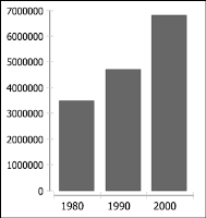
Figure 17‑99 Default series colors for a chart using one value series
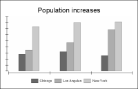
Figure 17‑100 Default series colors for a chart using three value series
In charts that have axes, you can choose to color the chart by category series instead. This approach is useful when you have only one value series, but you want to show variously colored series elements, as in the chart in
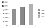
Figure 17‑101. The chart uses one value series, but shows each bar in the series in a different color. Coloring the chart by category series also displays the category series items, rather than the value series items, in the legend.
Figure 17‑101 Varied colors in a chart using one value series
Pie charts and meter charts work differently. By default, a bar or a meter chart varies the category series colors to show each pie sector or needle in a different color, as shown in
Figure 17‑102.
Figure 17‑102 Pie chart colored by category series
When first created, a chart uses default colors for series elements. To select different colors, modify the series palette. The chart uses the colors selected in the selection order in the palette list. If the chart shows more series elements than there are colors in the palette, it uses some colors more than once.
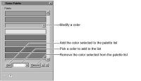
To specify the colors used in the chart, navigate to the Series section of Format Chart, then choose Series Palette to see the options shown in
Figure 17‑103.
Figure 17‑103 Series Palette
Use the following settings to modify the series palette:

To set an element in the chart to use particular colors, find the color in the palette, and move that color to the top of the palette.
To add a new color, select the color drop-down list to the right of Add, and use the color picker to select or create a color. When finished, choose Add.
To remove a color, select the color in the list, and choose Remove.
To modify a color, select it, then use the color picker to select or create a color.
When you finish adjusting the color palette, close Series Palette, then choose Finish in the chart builder.
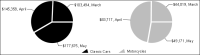
You can also color by value series to show all the sectors in a pie or all the needles on a meter in the same color. For example,
Figure 17‑104 shows the same pie chart, colored by value series.
Figure 17‑104 Pie chart colored by value series
To determine which data the legend displays, navigate to the Series section of Format Chart, then use Color By to select Value Series or Categories.