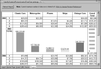
If a cross tab consists of many rows and columns, users might find it difficult to read and compare totals. Displaying totals as charts can improve the readability of the data.
Figure 18‑59 shows a cross tab where the year totals appear as a chart. You can easily compare the sales totals of each product line for a given year.