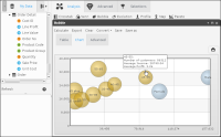
Using bubble analyses
A bubble diagram shows the distribution of categorical data across two axes of numeric variables. You can also view results on a data table.
Use a third variable to set the size of each bubble. To configure a bubble analysis, set two or three variables: two on the axes and an optional third to size the bubbles.
Instead of showing measures by attributes or categorical variables, as in the case of crosstabs, a bubble diagram shows groups or categories according to numeric variables, providing a different way of showing numeric data versus categorical data. For example, you can examine customers by age, order amounts, and average salary.
Drag a field to use as a categorical variable, such as profession, gender, age ranges, or number of children. Next, select continuous or numeric variables, such as age, salary, or purchase amount. The continuous variables are the axes of the analysis. For each variable, choose a function, such as count, sum, average, maximum, minimum, and a display type, such as percentages or totals. You may optionally choose a universal or target filter that applies only to this variable or measure.
You can set filters on a bubble analysis at either the measure level or at the complete analysis level. For example, you can set a partial filter when you are analyzing customers by age, and you need to view the order average for only the last month. You also, however, want to check the average salary for these age ranges, so you do not want the filter to be applied at the global‑analysis level, only at the order‑measure level.
You can use parametric filters as analysis filters.
Results can be sorted in ascending or descending order by measures.
The check box Show legend is only available for pivoted and pie-style charts, but there is also an option to set the maximum number of characters to display in chart labels. Hide chart labels by setting the maximum number of characters to 0.
The legend configuration is bound to the chart configuration, so if the chart configuration (type, rows, columns, or filters) changes, the legend changes. When you select a pie-style chart, clicking a value label separates the corresponding piece of the pie, but when the bubble is multidimensional, clicking a value label hides its graphical representation.
You can convert this type of analysis into a crosstab analysis.
How to add data to a new bubble analysis
1 In Analytics—Analysis, choose Bubble.
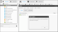
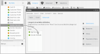
2 Drag a column from Data Tree to use as the categorical variable and drop it in the left column. A message that you must specify two continuous variables to calculate the analysis appears, as shown in
Figure 4‑8. Choose OK.
Figure 4‑8 Defining a continuous variable for a bubble analysis
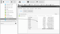
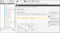
3 Drag a column from Data Tree to use as the continuous variable and drop it in the right column of the table, as shown in
Figure 4‑9. Choose Sum.
Figure 4‑9 Defining a continuous variable for a bubble analysis
4 Choose Advanced—Measures.
5 Choose New measure.
6 Type a name for the new measure.
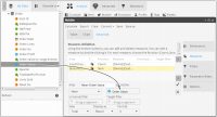
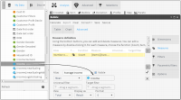
7 Select a function for the new measure, and drag a column the measure uses, as shown in
Figure 4‑10.
Figure 4‑10 Defining a new measure for a bubble analysis
8 In Format, select the number of decimal places to display.
9 Choose the check mark to create the measure.
How to add a filter to a new bubble analysis
1 From Bubble—Advanced, select Filters.
2 From Data Tree, drag a filter to use.
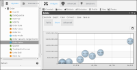
3 To see the new bubble analysis, choose Calculate. The bubble analysis appears on Chart, as shown in
Figure 4‑11.
Figure 4‑11 Visualizing a data measure using a bubble analysis chart
How to display multiple segments using a bubble analysis
1 In Analytics—Analysis, choose Bubble—Advanced.
2 From Data Tree, drag columns to use as the categorical variable, as shown in
Figure 4‑12.
Figure 4‑12 Adding multiple categorical variables to a bubble analysis
3 Choose Measures.
4 To rename an existing measure, double‑click the measure and type a new name, as shown in
Figure 4‑13. Choose the check mark to finalize the edit.
5 Choose New measure.
6 Type a name for the new measure.
Figure 4‑13 Renaming a measure
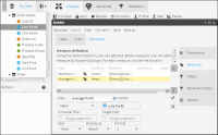
7 Choose a function for the new measure and drag a column the measure will use, as shown in
Figure 4‑14.
8 In Format, select the number of decimal places to display.
9 Choose the check mark to create the measure.
Figure 4‑14 Adding a new measure to a bubble analysis
How to duplicate measures on a bubble analysis
1 Choose Duplicate to create a measure similar to the one that is highlighted.
2 Type a name for the new measure, as shown in
Figure 4‑15.
Figure 4‑15 Duplicating a measure
3 Drag a column from Data Tree that is different from the one already displayed, as shown in
Figure 4‑16.
Figure 4‑16 Replacing a column in a duplicated measure
4 Choose the check mark to create the measure.
5 Choose Calculate. The bubble analysis appears on Chart, as shown in
Figure 4‑17.
Figure 4‑17 Visualizing a bubble analysis that shows multiple variables
Related topics
Video tutorials
