Using map analyses
A map analysis supports visualizing data on a geographic map. Analysis results display as a a chloropleth map on which each predefined region is assigned a color or shade. Each shade corresponds to the magnitude of data values for that region. For example, a map analysis assigns each region in a country map a different shade of red that corresponds to the number of unemployed customers in each region. In this example, a region that appears dark red has a high number of unemployed customers.
A map analysis assigns, by default increasingly darker shades of red to regions having values of correspondingly higher magnitude. Optionally, create a custom set of color shades. When selecting custom colors, consider the following points:

Darker colors typically represent data items with a higher magnitude.
To make clear distinct data ranges, select a distinct color shade for each range. Test map analysis results to verify that the map conveys meaning when viewed in color or in gray scale shades.
To provide effective contrast between data ranges, limit the number of colors to seven, if possible.
BIRT Analytics provides multiple maps with region names encoded. You can also add new maps. If necessary, you can use a decode field to match the names in the map to the region names in your data.
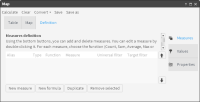
How to add a measure to a map analysis
1 Choose Analytics—Analysis—Map.
Figure 4‑32 Map definition view
3 In Measures, choose New measure.
4 Type a descriptive Alias.
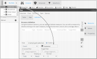
5 To define the new measure, drag a table from My Data, and drop it as shown in
Figure 4‑33.
Figure 4‑33 Adding a table to the measure definition
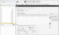
6 To filter the measure, drag a segment from Discrete Values and drop it in Universal filter, as shown in
Figure 4‑34.
Figure 4‑34 Adding a filter to the measure definition
7 Choose the check mark. A defined measure appears in Measures definition.
How to generate map analysis results
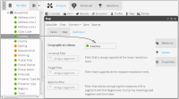
1 Choose Values.
2 To link geographic data to a measure, drag a column that contains geographic data from My Data and drop it in Geographical Column, as shown in
Figure 4‑35.
Figure 4‑35 Adding geographic data values to a measure definition
3 Choose Properties.
4 In Select map, select a map name that matches the geographic region defined for the measure. If no available map appears to match the geographic region for your analysis, ask a BIRT Analytics administrator to load the appropriate map.
5 Choose Calculate.
How to view map analysis results
To view graphical results, choose Map, if necessary.
To view data values that correspond to each color appearing in Map, choose Legend.
To see numerical results of the map analysis, choose Table.
To see analysis results appearing in Map on a crosstab, select Convert. Then, choose Crosstab.
Related topics
Video tutorials