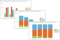
A column chart displays data values as a set of vertical bars. Categories on the horizontal axis and values on the vertical axis. This layout is useful for displaying data side-by-side for easy comparison, as shown in the chart on the left in
Figure 8‑2.
This chart supports a stacked or percent stacked chart subtype that also shows the relationships of values in each category to the whole, as shown in the charts in the center and on the right in
Figure 8‑2.