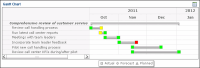
A Gantt chart is a bar chart that displays the progress of a series of initiatives plotted against time. This type of chart is useful for project planning, benchmarking, and providing a summary of a project’s status. A Gantt chart shows all initiatives in a tree, regardless of which initiative is selected in the dashboard.
Initiatives and subinitiatives display along the y-axis. The x-axis displays the total time allotted to initiatives for the selected comparison series, separated by month. Initiatives are represented as horizontal lines. The top initiative represents the earliest start date and latest end date of the subinitiatives in the branch. A vertical line indicates today’s date, if today’s date occurs between the earliest start date and latest end date range.
Subinitiatives display a start and end date performance-colored icon, either a diamond, square, or triangle. A square icon represents an actual date, a diamond represents a forecast date, and a triangle represents a planned date. The color of each icon represents the performance of that start or end date. Performance for a start or end date is calculated using actual date values. If a start or end date contains no actual dates, forecast values are used, then planned values. A gray color displays for initiatives that do not contain dates.
The Gantt chart in Figure 2‑37 shows the Comprehensive review of customer service call handling initiative tree comparing actual vs. planned dates.
Figure 2‑37 Gantt chart for an initiative tree
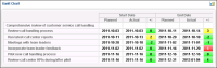
To show the data for initiatives in the Gantt chart in table format, choose Show chart as table. Figure 2‑38 shows the Comprehensive review of customer service call handling initiative tree in table format.