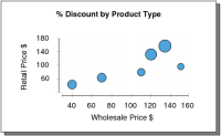
A bubble chart resembles a scatter chart, with a size dimension added at each data point. Use a bubble chart instead of a scatter chart to represent three numeric values per data point. Two numeric values define the position of a bubble on the plot area. A third numeric value defines the size of the bubble. Use color-coding to differentiate among category values, such as product lines. The example in
Figure 19‑8 plots the retail against the wholesale prices of a product, calculates the discount, and shows the amount of the discount using the size of each bubble.