In addition to formatting options that apply to charts in general, the chart builder provides formatting options that apply to individual chart types or subsets of the available chart types.
Formatting an area chart
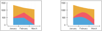
The style or color of the area borders can be changed or the borders themselves can be hidden. For example, Figure 21‑2 shows a chart having standard lines bordering the areas on the left and curved lines bordering the areas on the right. Both charts in Figure 21‑3 have no lines bordering the areas.
Figure 21‑2 Area charts using different border line options
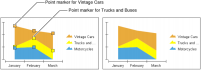
You can also add point markers that identify the data points that an area encloses. The legend uses the markers to identify the areas. Figure 21‑3 shows one area chart that has markers and one that does not.
Figure 21‑3 Area charts with and without point markers
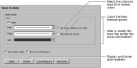
To format lines and markers on an area chart, navigate to the Value (Y) Series section of Format Chart, then modify labels, lines, or markers, as shown in Figure 21‑4. Line formatting affects marker borders as well as area borders.
Figure 21‑4 Format options for an area chart
Formatting a line or a scatter chart
Line and scatter charts use the same formatting attributes. By default, a line chart shows lines between data points, but a scatter chart shows only the data points. A scatter chart does support formatting to show lines between data points. To format a line or scatter-chart series, navigate to the Value (Y) Series section of Format Chart. The settings that can be modified for the chart lines and markers are shown earlier in Figure 21‑4.
Formatting a bar chart
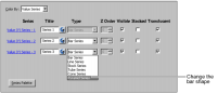
By default, a bar chart displays rectangles without outlines, but you can change the bars to cones, tubes, or pyramids, or add a bar outline. To format a bar chart, navigate to the Series section of Format Chart. Use the settings to modify the bars, as shown in Figure 21‑5.
Figure 21‑5 Formatting options for a bar chart series
To add an outline to the bars or other risers, navigate to the Value (Y) Series section of Format Chart. In Series Outline, select a color.
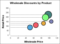
Formatting a bubble chart
Adding acceleration lines to bubble charts emphasizes their y-axis value, as shown by the dashed lines in Figure 21‑6. You can also add various styles and colors of lines around the bubbles. In Figure 21‑6, a thick black line around the bubbles makes them stand out.
Figure 21‑6 Using acceleration lines and bubble borders
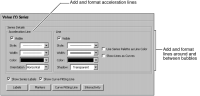
To change these colors and styles, navigate to the Value (Y) Series section of Format Chart. Use Series Details to add and format acceleration lines, or to add lines around the bubbles, as shown in Figure 21‑7.
Figure 21‑7 Bubble chart formatting options
Formatting a difference chart
Difference charts use fill areas to highlight differences in data. The chart can display positive differences in one color and negative differences in another. For example, use a difference chart to show how sales compare to quota over a period of time, where positive values represent sales in excess of quota and negative values represent sales below quota.
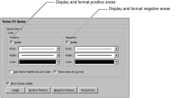
To show positive and negative differences, navigate to the Value (Y) Series section of Format Chart. Use Value (Y) Series to display and format positive and negative areas on the difference chart, as shown in Figure 21‑8.
Figure 21‑8 Displaying positive and negative fills on a difference chart
Formatting a Gantt chart
Gantt charts display project schedules using bars to show beginning and ending dates of multiple tasks. The colors of the bars represent the task status. Optionally, markers designate the start and end dates of tasks.
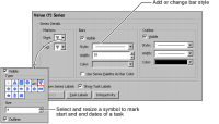
To add and format task markers and bars, navigate to the Value (Y) Series section of Format Chart. Use Value (Y) Series to change and resize the symbols that mark the start and end of a task. You can also specify the color, style, and size of symbol markers and task bars, as shown in Figure 21‑9.
Figure 21‑9 Formatting a Gantt chart
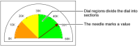
Formatting a meter chart
When you format a meter chart series, you work with the chart elements shown in Figure 21‑10.
Figure 21‑10 Elements of a meter chart
You can modify the following meter chart attributes:
Dial size. Determine the size of the dial’s radius as a proportion of the meter. Use start- and stop-angle settings to specify the portion of a complete circle that the meter comprises.
Dial scale and tick marks. Set the range of values and the number or interval settings of tick marks.
Dial-region size, color, and placement.
Needle formats. Modify the style and width of the needle and its pointer.
Multiple meter placement. If a chart uses multiple meters to present data, you can arrange the meters in rows or columns.
Label settings. Show or hide labels for regions and for the chart data point.
Working with the dial size
To change the distance between the center of the chart and the outside of the dial, you change the dial radius. Use percentage settings to size the dial relative to the meter. For example, a setting of 50 creates a dial radius that is half the distance from the center of the meter to its outer boundary. In a chart that uses more than one value-series definition, you set a single dial radius that applies to all series. If different series contain different dial radius values, the dial uses the larger value.
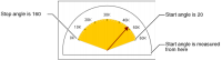
To change the shape of a dial, you change the start- and stop-angle settings. The angles are measured counter-clockwise from the right. For example, in Figure 21‑11, the dial uses a start setting of 20 and a stop setting of 160.
Figure 21‑11 Start- and stop-angle settings in a semicircular meter
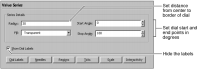
To set the size of a dial, navigate to the Value Series section of Format Chart. Use Series Details to set or modify the dial size, as shown in Figure 21‑12. You can also hide the dial labels using this page.
Figure 21‑12 Dial size and label visibility settings
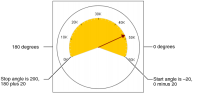
The start and stop settings of the dial affect the style of the meter. If both angle settings are between 0 and 180, the chart displays a half-circle. If either angle setting is less than 0 degrees or greater than 180 degrees, the chart displays a full circle. For example, the chart shown in Figure 21‑13 uses a start angle of –20 and a stop angle of 200. The first value in the dial, 0, appears at 200 degrees, and the last, 60K, appears at –20 degrees.
Figure 21‑13 Start- and stop-angle settings in a full meter and full dial
Working with the dial scale and tick marks
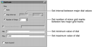
The chart builder uses the available data to set a span for the dial, then it places tick marks at appropriate intervals. The dial scale defines the range of data values that the meter displays. To change the scale of a dial, navigate to the Value Series section of Format Chart, then choose Scale. Use the Scale settings to change the range or spacing of the data the dial displays, as shown in Figure 21‑14.
Figure 21‑14 Dial scale options
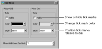
To modify the tick marks on a dial, navigate to the Value Series section of Format Chart, then choose Ticks. Use the settings to modify the major or minor grid ticks, as shown in Figure 21‑15.
Figure 21‑15 Dial tick mark options
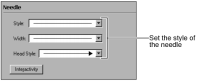
Working with needle formats
You can change the line style, width, and head style of a needle. Navigate to the Value Series section of Format Chart, then choose Needle to modify the needle appearance, as shown in Figure 21‑16.
Figure 21‑16 Needle style options
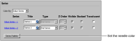
To change the color of a needle that represents a value series in a meter chart, select Series Palette, as shown in Figure 21‑17. Then, choose a color from the options on the series palette.
Figure 21‑17 Changing needle color
Working with multiple meters
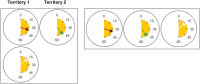
In a chart with multiple meters, you can position the meters by specifying how many columns to use to display them. For example, to use three meters to contrast the performance of two managers in one territory and one manager in another territory, specify a two‑column grid. Using two columns for three meters produces the chart shown on the left in Figure 21‑18. To arrange the meters horizontally, as shown on the right, specify three columns.
Figure 21‑18 Using two- and three-column grids in a meter chart
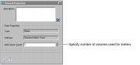
To lay out the meters, navigate to the Chart Area section of Format Chart, then choose General Properties. In Grid Column Count, select the number of columns the chart uses to display the meters, as shown in Figure 21‑19.
Figure 21‑19 Grid Column Count option
Specifying a grid column count of 1 arranges multiple meters vertically. Specifying a grid column count equal to the number of meters arranges the meters horizontally.
Working with meter chart labels
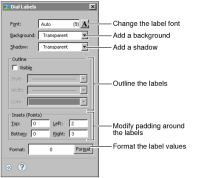
To format the labels that identify points on the dial, navigate to the Value Series section of Format Chart and choose Dial Labels. Use the settings shown in Figure 21‑20 to format, outline, or pad the labels.
Figure 21‑20 Dial label options
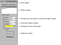
Working with dial regions
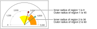
To highlight the values on the dial, you use dial regions. Dial regions are similar to axis markers. You determine a start and an end value for each region. After you set up the regions, you can change the region color or outline. If regions overlap, the last region that you create takes precedence in formatting. You can also set the inner and outer radius of a region to specify the part of the dial showing the region’s color. For example, Figure 21‑21 shows a chart with two regions. The region on the left has an outer radius of 45. The region on the right has an inner radius of 30 and an outer radius of 60.
Figure 21‑21 Regions in a dial
To add and format a dial region, navigate to the Value Series section of Format Chart, then choose Regions to use the options shown in Figure 21‑22. To control the region’s radius, set the distance from center of dial to the inner and outer edge of region.
Figure 21‑22 Formatting regions
Formatting a pie chart
You can modify the following characteristics of pie charts:
Aspect ratio and rotation
Change the aspect ratio to make a pie chart oval, and rotate the chart.
Color and outline
Select color and outline settings for each pie slice.
Distance between pie slices
Separate one or more slices of the pie from the rest of the chart.
Leader lines
Modify the appearance of leader lines or hide them.
Presentation of multiple and grouped pie charts
Improve the appearance of multiple pie charts by specifying a uniform size for individual pie charts. Arrange grouped pie charts in rows or columns.
Working with aspect ratio and rotation
Changing the aspect ratio of a pie chart makes it oval rather than circular, as shown in Figure 21‑23. Rotating a pie chart changes the position of the slices.
Figure 21‑23 Pie chart displayed as a circle and an oval rotated 90 degrees
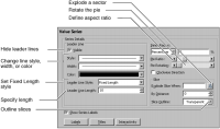
To modify aspect ratio or rotation, navigate to the Value Series section of Format Chart, shown in Figure 21‑24.
Figure 21‑24 Formatting a pie chart
By default, Pie Ratio is set to an aspect ratio of 1, creating a circle. To create an oval, scroll to a higher or lower aspect ratio. An aspect ratio greater than 1 results in a vertically stretched oval, and an aspect ratio less than 1 creates a horizontally stretched oval. To rotate the chart, in Pie Rotation, scroll from a default value of 0.0 to the degrees by which to rotate the chart. The chart rotates in a counter‑clockwise direction.
Working with leader lines
As shown in Figure 21‑24, the line style, width, and color of leader lines can be modified in the same way as the formatting attributes of other lines in a chart. To specify the same length for all leader lines, select the leader line style, Fixed Length. To hide the leader lines, deselect Visible.
Working with pie slices
You can outline each slice and change the outline properties. You can also select a color palette for the sectors. To outline pie-chart slices, navigate to the Value Series section of Format Chart, then use Slice Outline to select an outline color, as shown in Figure 21‑24. You can also set the percentage of the plot area used to render the pie slices.
You can set a minimum value for pie slices. A slice with a value equal to or greater than the minimum appears as usual. Slices with values below the minimum are combined in a new remainders slice. You can create a label for the remainders slice to display in the legend.
You can set the minimum as a static value or as a percentage of the pie value. For example, you can show sales totals for a group of customers and combine customers with sales below $1,000,000.00 in a sector called Infrequent Orders, or you can combine customers with sales below two percent of the total sales.
To specify a minimum slice size, navigate to the Category Series section of Format Chart, then set up a minimum slice size equal to either a value related to slice size or to a percentage of the pie, as shown in Figure 21‑25.
Figure 21‑25 Minimum slice settings
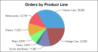
Exploding pie slices
By default, pie slices are not offset from the chart. Slices appear joined to one another at the center of the chart, and leader lines connect slices and data labels, as shown in Figure 21‑26.
Figure 21‑26 Using default formatting settings
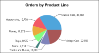
To emphasize a slice, explode it. This action offsets the slice from the rest of the chart, as shown in Figure 21‑27.
Figure 21‑27 Exploding the Trains slice
First, decide which slices to explode. To explode all pie slices, specify the offset in By Distance. To explode specific pie slices, create an expression. For example, create an expression to explode only the slices that represent total orders under $3000.
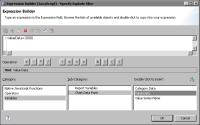
Navigate to the Value Series section of Format Chart. In Explode Slice When, open Expression Builder. Expression Builder includes a Variables category to facilitate creating the expression, as shown in Figure 21‑28.
Figure 21‑28 Building an expression to explode a pie slice
Use the Variables category to add variables, such as Value Data or Category Data, to the expression. For example, use the following expression to explode slices that have a value of less than 3000:
valueData<3000
In By Distance, provide the offset. For example, a value of 25 offsets exploded slices by twenty-five percent of the size of the original pie.
Arranging multiple pies
When you create a report that contains multiple pie charts, enhance the appearance of the report by making the pies a uniform size. Double-click one of the pie charts to open the chart builder. Navigate to the Chart Area section of Format Chart. In Coverage, type 50 to specify that the pie cover 50 percent of the plotting area. Preview the report and compare the size of the pie you scaled to others in the report. Experiment using different values until you find the value that makes the pies a uniform size.
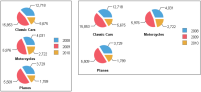
When you create a single chart that uses multiple pies, you can specify how many columns to use to display them. For example, in Figure 21‑29, the chart on the left uses one column, so the chart builder positions the pies vertically, one below the other, within the column. The chart on the right uses two columns, so the chart builder positions pies in each of two columns.
Figure 21‑29 Pie charts using different column-count settings
To arrange multiple pies in a pie chart, navigate to the Chart Area section of Format Chart, then choose General Properties. In Grid Column Count, select how many columns to use to display the pies.
Formatting a stock chart
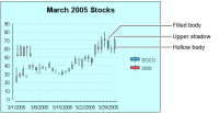
When you format a stock chart, change the color of the filled body of the candlestick using the series palette. You can also change the color and style of the shadows and hollow body, as shown in Figure 21‑30.
Figure 21‑30 Stock chart
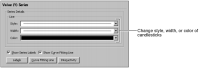
To format a stock-chart series, navigate to the Value (Y) Series section of Format Chart, then format the candlesticks, display series labels, or add a curve-fitting line, as shown in Figure 21‑31.
Figure 21‑31 Stock-chart series options
Formatting a three-dimensional chart
When you format a three-dimensional chart, use axis rotation to change the orientation of the chart or use unit spacing to set the space between series. You can also change the wall and floor colors and set the series depth.
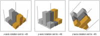
Working with chart rotation
You can rotate the axes of a three-dimensional chart. To rotate axes, use the following settings:
The x-axis rotation controls how the chart tilts toward or away from the viewer.
The y-axis rotation controls how the chart pivots left and right on the y‑axis in the center of the chart.
The z-axis rotation controls how the chart tilts up and down on the central z‑axis.
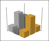
By default, a three-dimensional chart uses an x-axis rotation of –20, a y-axis rotation of 45, and a z-axis rotation of zero. A chart that uses default rotation settings appears oriented like the one shown in Figure 21‑32.
Figure 21‑32 Three-dimensional chart using default axis rotation
Figure 21‑33 shows the effects of changing each setting in the sample chart.
Figure 21‑33 Three-dimensional charts using different rotation settings
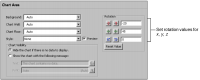
To change the rotation of an axis, navigate to the Chart Area section of Format Chart, then provide a rotation value, as shown in Figure 21‑34.
Figure 21‑34 Setting rotation options
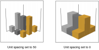
Working with the space between elements
To control the space between adjacent series in a three-dimensional chart, you use unit spacing. The unit-spacing value is the percentage of the series width that appears between each series. For example, the default unit spacing is 50. Consequently, the space between two series elements in the chart, such as two sets of bars, is approximately 50 percent of the width of one series element. Figure 21‑35 presents the difference between two unit-spacing settings in a sample three-dimensional bar chart.
Figure 21‑35 Charts using different unit-spacing settings
To change the spacing between adjacent series, navigate to the Chart Area section of Format Chart, then choose General Properties. In Unit Spacing, provide a value. The value specifies the percentage of the series width to use to separate series elements.
Setting the wall and floor colors
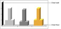
In a chart that has depth, or a three-dimensional chart, you can modify the color of the chart wall and floor. The default wall and floor color setting is transparent. Figure 21‑36 shows where the wall and floor appear in a two‑dimensional bar chart with depth.
Figure 21‑36 Wall and floor of a chart using depth
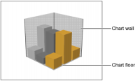
Figure 21‑37 shows the locations of the wall and floor in a three-dimensional chart.
Figure 21‑37 Walls and floor of a three-dimensional chart
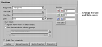
To set the wall or floor color of a chart using depth or a three-dimensional chart, navigate to the Chart Area section of Format Chart. Use the settings shown in Figure 21‑38 to set a wall or floor color.
Figure 21‑38 Wall and floor color options
Setting the series depth of a chart
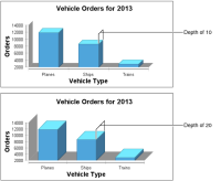
In a chart having depth, or in a three-dimensional chart, you can specify how deep the chart bars stretch. For example, Figure 21‑39 compares different series depths for a two-dimensional bar chart with depth. The upper chart uses a series depth of 10 points. The lower chart uses a series depth of 20 points. The units of measurement, such as points, for the series depth match the units that appear in the chart. You can specify the depth of lines that appear in a two-dimensional with depth pie chart.
To set the depth of series elements in a chart, navigate to the Chart Area section of Format Chart, then choose General Properties. Provide a value in Series Depth.
Figure 21‑39 Comparing different depths of series elements