By default, a chart displays labels that identify value-series values, such as the height of a bar in a bar chart or the size of a sector in a pie chart.
To display different data in the labels, change the data point settings. The data point settings determine what text each label displays. Typically, the label shows the value-series value, such as the highest point of a line chart on the y‑axis. You can also show where the point appears on the x-axis, use the series value to show to which group of data points a point belongs, or display the value as a percentage of the total value of all points in the chart.
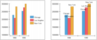
For example, in Figure 21‑108, the first chart uses a legend to show which bar represents each series. The second chart labels each bar with the city name.
Figure 21‑108 Bar charts using different label settings
After you decide the data to show in the labels, you can change the number format of the data points or add a prefix or a suffix to the label expression. You can also use a separator between values. For example, the chart in Figure 21‑108 could display the city value and the year value, separated by a comma, such as Chicago, 1980. In a different chart, you could add a currency symbol before a value or append text, such as Orders.
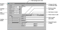
To modify the data a label displays, navigate to the Value Series section of Format Chart, then choose Labels. Use the settings in Values, shown in Figure 21‑109, to set up the data the label displays.
Figure 21‑109 Label data settings
To format data point labels, navigate to the Value Series section of Format Chart, then choose Labels. Use the settings in Values to set up the data the label displays, as shown in Figure 21‑109.