Chart gadgets are graphical representations of data from a BIRT data object. Charts are useful for summarizing numeric data and showing the relationship between sets of values, called series. For example, a chart can show sales by region, average temperatures by month, or the price of a stock over three months. Because a chart presents a picture, it reveals trends that are not apparent in a table.
When adding a chart to a dashboard, you perform the following tasks:
Choose a chart type.
Specify the data to present in the chart.
Format the chart.
Choose a location for the chart on the dashboard.
How to create a chart gadget
This procedure requires a dashboard you can edit and a BIRT data object. Create a new dashboard if one does not already exist. To create a chart gadget, complete the following steps:
1 Choose a chart type in the dashboard editor by selecting Insert➛Chart and choosing a chart type. In this example, choose Insert➛Chart➛Bar Chart.
2 Select the data to display in the chart by completing the following steps:
1 In Chart Builder—Data—Use Data, select a data source. If no data source appears, choose New Data to select a BIRT data object from available data objects in the BIRT project.
2 Select a data column to display in the chart category axis.
3 Select a data column to display in the chart value axis.
3 Group and aggregate the data if it is not already aggregated in a data cube by completing the following steps:
1 Enable Group Categories to aggregate data on the value axis.
If you use date values to group categories, select a time interval by which to group the dates, such as years or months.
2 Specify data aggregations for each data column on the value axis.
3 To display a legend, set group legend items to the name of a data column.
If you use date values to group legend items, select a time interval by which to group the dates, such as years or months.
4 The following optional tasks are available when you create the chart or after the chart has been added to the dashboard:
Specify gadget appearance, such as name and size, in Chart Builder—General.
Limit displayed data with filter conditions, in Chart Builder—Filter.
Format the chart, in Chart Builder—Format. For example, select a chart theme and a chart subtype, enable zoom, enable the timeline range selector, or customize the display of each axis.
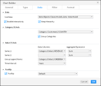
Figure 7‑1 shows the data configuration of a finished chart.
Figure 7‑1 Configuring data to display in a chart
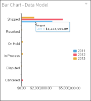
5 Choose OK to create the new gadget on the dashboard. Figure 7‑2 shows the data configuration of a finished bar chart.
Figure 7‑2 Displaying the finished chart on the dashboard
Enable interactive filtering, if desired, by linking the chart to a data selection gadget. After the chart is placed on the dashboard, it links to data selection gadgets that use the same data source. You can remove these links or add new ones.
Selecting a chart type
BIRT dashboards provide several chart types. The following sections describe the chart types BIRT dashboards support. Several of the chart types include subtypes.
About area charts
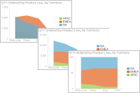
An area chart displays data values as a set of points, connected by a line, with the area below the line filled. You typically use an area chart to present data that occurs over a continuous period of time. There are three subtypes of area charts: overlay, stacked, and percent stacked.
In an overlay area chart, shown on the left in Figure 7‑3, the areas of multiple series overlap. Use the overlay area chart to show only one series, for example, only sales for Asia. The overlay chart subtype is not suitable for showing multiple series if the data values overlap. For example, in a chart displaying sales values for global territories, if the values in one territory, the U.S., are the highest for every quarter, the data for the U.S. obscures the data for Europe and Asia.
Figure 7‑3 Overlay, stacked, and percent stacked area charts
In a stacked area chart, multiple series are stacked vertically, as shown in the chart at the center in Figure 7‑3. The example shows that the stacked area chart is suitable for multiple series of data because the chart displays totals for all series and displays the proportion that each series contributes to the total. The height of the top line shows the total value for each quarter. Each shaded area represents the sales amount for a specific region.
In a percent stacked area chart, as shown on the right in Figure 7‑3, multiple series are stacked vertically, and the values appear as a percentage of the whole. As the chart in Figure 7‑3 shows, the sales values are displayed in percentages instead of the actual numbers, as shown in the previous area charts. The percent stacked area chart is meaningful only when displaying and comparing multiple series.
About bar charts
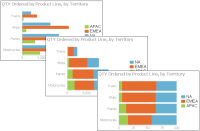
A bar chart, by default, displays data values as a set of horizontal bars, but you can transpose the axes to display vertical bars. A bar chart is useful for displaying data side by side for easy comparison. There are three subtypes of bar charts: side‑by‑side, stacked, and percent stacked. The stacked and percent stacked bar charts are functionally similar to the stacked area chart and percent stacked area chart subtypes.
In a side‑by‑side bar chart, multiple series appear as side‑by‑side bars, as shown in the chart on the left in Figure 7‑4. This bar chart uses the same data as the area charts shown in earlier sections.
Figure 7‑4 Side‑by‑side, stacked, and percent stacked bar charts
In a stacked bar chart, multiple series are stacked vertically, as shown in the chart in the center in Figure 7‑4. The stacked bar chart shows totals for each category, as well as the proportion that each series contributes to the total.
In a percent stacked bar chart, multiple series are stacked vertically, and the values are shown as a percentage of the whole. As seen in the chart on the right in Figure 7‑4, the sales values are shown in percentages instead of actual numbers, as shown in the previous bar charts.
Like the percent stacked area chart, the percent stacked bar chart is meaningful only when displaying and comparing multiple series. This chart subtype is typically not used if you are displaying only one series, for example, only sales for Asia.
About bubble charts
A bubble chart displays three sets of numeric data values at a time, two values are data points with x‑y coordinates on the axes. The third value defines the size of the bubble at each point. A typical use of a bubble chart is to present financial data such as quantity sold, profit margin, and total profit sales of multiple product lines. Figure 7‑5 shows a bubble chart where the size of the circle indicates the quantity sold.
Figure 7‑5 A bubble chart
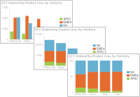
About column charts
A column chart displays data values as a set of vertical bars, with categories on the horizontal axis and values on the vertical axis. This layout is useful for displaying data side by side for easy comparison, as shown in the chart on the left in Figure 7‑6.
Figure 7‑6 Side‑by‑side, stacked, and percent stacked column charts
This chart supports a stacked or percent stacked chart subtype that also shows the relationships of values in each category to the whole, as shown in the charts in the center and on the right in Figure 7‑6.
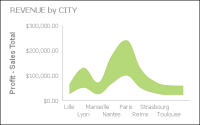
About difference charts
A difference chart displays the variation between two values by shading the area between those values. Figure 7‑7 shows profit by displaying the difference between the revenue and the cost of goods sold, for cities in France. You typically use a difference chart to show deviation between two sets of values, such as the high and low temperature for each day.
Figure 7‑7 A difference chart
About doughnut charts
A doughnut chart is a circular chart that is divided into sectors or slices. Each sector represents a value that is proportional to the total value, as shown in Figure 7‑8.
Figure 7‑8 A doughnut chart
About Gantt charts
A Gantt chart graphically presents project scheduling information by displaying the duration of tasks. One axis contains the time series, and the other contains tasks. You can use color-coded bars to show the planned duration of the stages to complete the tasks. Bars can use multiple colors to differentiate between stages. Gantt charts use symbols on bars to mark beginning and ending dates. The colors of the bars represent the task status. Optionally, markers designate the start and end dates of tasks. Figure 7‑9 shows a Gantt chart.
Figure 7‑9 A Gantt chart
About line charts
A line chart displays data values as a set of points that are connected by a line. You typically use line charts to present large amounts of data that occur over a continuous period of time. A line chart is the most basic type of chart in finance. The chart on the left in Figure 7‑10 shows an example of an overlay line chart.
Figure 7‑10 Overlay, stacked, and percent stacked line charts
A line chart is similar to an area chart, except that the line chart does not fill in the area below the line. In an overlay line chart, multiple series appear as overlapping lines, as shown in the chart on the left in Figure 7‑10. The line chart supports stacked and percent stacked subtypes.
In a stacked line chart, multiple series are stacked vertically, as shown in the chart in the center in Figure 7‑10. The stacked line chart shows totals for each series, as well as the proportion that each series contributes to the total.
In addition, as the example shows, a user can easily misinterpret the data in a stacked line chart. There is no obvious indication that the top line shows the total sales amount for each quarter, and the middle line shows the difference in the sales amount between EMEA and APAC. Verify that the title of the chart or other text describing the chart explains the purpose of the chart.
In a percent stacked line chart, multiple series are stacked vertically and the values are shown as a percentage of the whole. As shown in the chart on the right in Figure 7‑10, the sales values appear in percentages instead of numbers. Like the percent stacked area chart, the percent stacked line chart makes sense only when displaying and comparing multiple series. If you are displaying only one series, such as sales for EMEA, an overlay subtype is the most effective line chart. Both the stacked line chart and the percent stacked line chart are not as effective as their area chart counterparts.
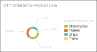
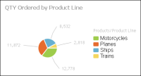
About pie charts
A pie chart is a circular chart that is divided into sectors or slices. Each sector represents a value that is proportional to the sum of the values. Use a pie chart to show the relationship of parts to the whole, for example, the order quantity each product line contributes to the total, as shown in Figure 7‑11.
Figure 7‑11 A pie chart
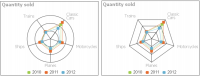
About radar charts
Radar charts compare the aggregate values of one or more series of data. A separate spoke from the chart center is shown for each category and each spoke is connected by an arc. A line is drawn connecting the data values for each spoke, giving the chart a star-like appearance. Radar charts have two subtypes: standard radar charts and spider radar charts, as shown in Figure 7‑12.
Figure 7‑12 Standard and spider radar charts
A spider radar chart connects the outer spokes using lines and a standard radar chart uses arcs, as shown in the chart on the left in Figure 7‑12. Radar charts are most effective for small data sets containing only a few hundred data rows. For larger data sets, or those containing a time series, use a line chart.
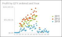
About scatter charts
A scatter chart presents data as x‑y coordinates by displaying two sets of numeric values as single data points. A scatter chart typically displays scientific and statistical data, because it shows if there is a relationship between two sets of measurements. For example, use a scatter chart to compare salaries and years of experience or weight and exercise. The more data values you include in a scatter chart, the clearer the trends the data reveals.
The scatter chart in Figure 7‑13 shows the relationship between quantity ordered and profit over three years. Each pair of values, quantity ordered and profit, is plotted as a single x‑y value.
Figure 7‑13 A scatter chart
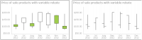
About stock charts
A stock chart displays a stock’s open, close, high, and low values for a set of trading dates. A stock chart can show the data for one stock or for multiple stocks. Although a stock chart is typically used to display stock data, you can also use it to chart other values such as four daily temperature values for a set of dates: high, low, sunrise, sunset. The stock chart has two subtypes: the candlestick and bar stick stock charts.
A candlestick stock chart consists of a series of boxes with lines extending up and down from the ends, as shown in the chart on the left in Figure 7‑14. The top and bottom points of each line indicate the high and low values, respectively. The top and bottom of each box indicate the open and close values. If the close value is higher than the open value, the box is white. If the open value is higher than the close value, the box is shaded. This style enables you to see immediately whether a value posted a gain or a loss for a given day.
Figure 7‑14 A candlestick and bar stick stock chart
A bar stick stock chart consists of a series of vertical bars with horizontal tick marks, as shown in the chart on the right in Figure 7‑14. The top and bottom points of each bar indicate the high and low values, respectively. The horizontal tick marks indicate the open and close values. The tick mark on the left of the bar is the open value. The tick mark on the right of the bar is the close value. A bar stick stock chart typically shows the change in price over a period of time. The candlestick stock chart shows the gain or loss pattern more clearly than the bar stick stock chart.
Selecting data for charts
You can select, filter, group, and aggregate data when you create the chart. Adding a chart gadget to a dashboard displays Chart Builder—Data, where the developer selects data to display in the chart. Choose a BIRT data object and select a data set, data cube, or data model. Then, assign the data columns to the different parts of the chart. Figure 7‑15 displays an example bar chart’s data configuration.
Figure 7‑15 Selecting data to display in a bar chart
You can select one data column from the data source to display on the category axis of the chart and up to two data columns to display as series on the value axis of the chart. The pie and doughnut chart only support a single series.
If hyperlinks exist in the data object file, they can appear in the chart by selecting Chart Builder➛Data➛Enable Interactivity. Hyperlinks enable users to open a URI or drill through to another BIRT document file when choosing a value such as a customer name in a table. This is similar to a hyperlink on a web page.
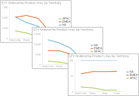
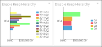
Data cubes and data models can include a hierarchy structure. This enables users to drill into the chart categories for details by selecting a part of the chart, such as sales activity for a specific month in a specific year. You can break this hierarchy if you want to aggregate values without their parent level.
For example, if you keep a data cube’s hierarchy and group legend items by a time interval of quarters, the legend displays an each quarter of each year. If you disable Keep Hierarchy in the chart, then the legend groups values only by the quarter and not by year.
Figure 7‑16 displays an example bar chart’s data configuration.
Figure 7‑16 Grouping by quarters with and without hierarchy
Using category groups
Data sets and data models displayed in charts support grouping by category, typically shown on the horizontal axis. When a category is grouped, values for the selected category are aggregated. For example, a chart about customer orders groups data by country and displays the total sum of sales orders. The resulting chart displays each country name once with a sum of all sales for each country.
Using legend groups
You can display subgroups of values using legend items. When legend items are grouped by a data column, the different values in that data column appear next to the chart as legend items. For example, you have a bar chart that already groups the data series by product line. If you group legend items by order date and choose an interval of years, each product line category displays an additional bar for each year of sales.
If you choose to also display the legend, each year appears as a legend item next to the chart. When the chart data source is a data set or a data model, users can select a legend item to hide the values in the selected legend group. The pie and doughnut chart do not support legend groups.
When the chart data source is a data cube, users can select a legend item to drill down into the data hierarchy. Users can drill down into both the category and series data at the same time.
For example, consider a bar chart that displays data from a data cube. The category axis displays country names and the value axis displays the quantity of goods sold. The chart also displays a legend that groups the axis of values by the year of the sales data. If a user views the chart and selects the bar for a country, they drill down into details of the country category and the chart displays cities in the country. If the user selects the legend item for one of the displayed years, they drill down into the chart and see details of the selected year, such as data by the months of the year.
Using aggregate expressions
You can create aggregate expressions to summarize values from a data set or data model and display the results in a chart. Table 7‑1 shows the functions available in chart gadgets.
Table 7‑1 Aggregate functions for charts
Function
Description
Average
Returns the average of the values
Count
Returns the number of values, including duplicate values
Distinct Count
Returns the number of values, excluding duplicate values
First
Returns the first value among the values
Last
Returns the last value among the values
Max
Returns the largest value among the values
Min
Returns the smallest value among the values
Sum
Returns the sum of the values
Formatting charts
Once a chart is selected, you can format and enhance your chart in Chart Builder—Format. You can replace the automatic title, change fonts, change the chart size, select a chart theme, display a legend, change the label presentation, and add titles to the axis. Different charts include additional features such as subtypes and zoom in to axis.
When a chart title is set to auto, the title is based on the values displayed, and updates when a user changes the displayed values, such as drilling down into details of a data cube. To set a fixed title that does not change, remove the auto title selection and type a new title.
Choosing a chart theme
Chart themes customize the appearance of a chart and can change color, font, and display properties for charts. These themes are created in BIRT Designer Professional.
The following section shows examples of themes used in area charts:
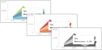
The chart on the left uses no theme and the one on the right uses the modern theme, as shown in Figure 7‑17.
Figure 7‑17 Area charts using no theme and the modern chart theme
The example shown in Figure 7‑18 displays area charts using the clean blue, warm red, and grayscale themes.
Figure 7‑18 Area charts using the clean blue, warm red, and grayscale themes
Chart themes customize the appearance of a chart and can contain custom JavaScript for enhanced interactivity. Each theme changes a chart’s colors, fonts, and display. These themes are created in BIRT Designer Professional. Themes are stored in a BIRT design file when they are used in a single report. You can store a theme in a BIRT library file to enable multiple chart gadgets and BIRT design files to use the same theme.
Enabling chart zoom
Chart users can zoom in to the chart to view details of the selected data when zoom is enabled for categories or values. Zoom is available in area, bar, bubble, column, difference, Gantt, line, scatter, and stock charts. Zoom options are set in Chart Builder—Format.
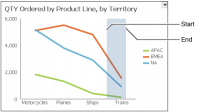
Users can zoom in to charts to see greater detail by selecting a start point on the x‑axis, dragging the mouse to the end point, and then releasing the mouse button, as shown in Figure 7‑19.
Figure 7‑19 Zooming on the x‑axis
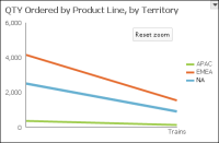
Figure 7‑20 shows the results of an x‑axis zoom. Choose Reset zoom to return the chart to the default display or continue to zoom in to view additional detail.
Figure 7‑20 Finished zoom on the x‑axis
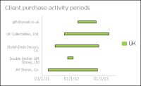
Enabling a timeline
When the category is a time field, you can select the time range selector and bottom slider. You can enable a time range selector and a timeline slider for users to select time intervals in area, bar, column, difference, line, scatter, and stock charts. Timeline options are set in Chart Builder—Format.
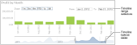
The time range selector appears under the chart title and enables a user to zoom in to 1‑, 3‑, or 6‑month intervals, year to date, 1 year, and all values on the chart. The time range slider appears at the bottom of the chart and enables users to select a time period by sliding a bar to the beginning and end of the period.
Figure 7‑21 shows a chart displaying the time range selector and bottom slider.
Figure 7‑21 Displaying a time range selector and bottom slider on a chart
 Choose a chart type.
