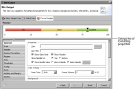
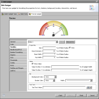
Property | Gadget | Usage |
Background Color | All | Sets the background color of the gadget. |
Base Color | All | Sets the color scheme of the gauge. You can use either a base color or a preset color scheme. All other selections derive from this selection. |
Center X Coordinate | Meter | Specifies the x coordinate of the gauge center. |
Center Y Coordinate | Meter | Specifies the y coordinate of the gauge center. |
Color | All | Specifies the color of the border around the gadget. |
Connect Missing Data | Sparkline | Connects a line between missing points of data. |
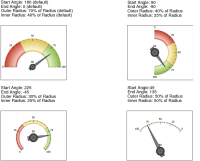
End Angle | Meter | Specifies the angle where the gauge ends drawing. |
Fill color | Cylinder, thermometer | Specifies the internal color of a gadget, such as a cylinder or thermometer. |
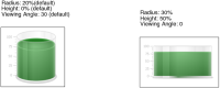
Height | Cylinder, thermometer | Specifies the percentage of the gadget area that the gadget image height occupies. |
Inner Radius | Meter | Specifies the radius of the inner portion of the gauge. |
Outer Radius | Meter | Specifies the radius of the outer portion of the gauge. |
Preset Scheme | All | Selects a preset color scheme for the gauge. You can use either a base color or a preset color scheme. All other selections derive from this selection. |
Radius (or Bulb Radius) | Cylinder, thermometer | Species the percentage of the gadget area that the gadget image radius occupies. |
Show Border | All | Enables or disables the border around the gadget. |
Show Dial Values | Meter | Enables or disables the value display on the dial. Set dial position above or below the dial. |
Show Needle On | Linear gauge | Set to top to have needles appear on top of the gadget, set to bottom to have them appear on the bottom. |
Show Needle Value | Linear gauge | Enables or disables the display of the value at the needle. If enabled, set to Above Needle to display the value above the needle, or set to Below Needle to display the value below the needle. |
Show Value | Cylinder, thermometer | Enables or disables the display of the value the gadget is illustrating. |
Start Angle | Meter | Specifies the angle where the gauge begins drawing. |
Start X Coordinate | Cylinder | Chooses a starting x coordinate percentage that positions the image in the gadget. Selecting 0 starts the image at the left side of the gadget. |
Start Y Coordinate | Cylinder | Chooses a starting y coordinate percentage that positions the image in the gadget. Selecting 0 places the starting y coordinate at the top of the gadget, selecting 100 places it at the bottom. |
Style | All | Supports adding a style to the gadget. |
Sub-Title | All | Adds a subtitle to the gadget. |
Title | All | Adds a title to the gadget. |
Turn Off All Animation | All | Enables or disables all animation effects. |
Turn Off Default Animation | All | Enables or disables default animation. |
Viewing angle | Cylinder | Specifies the angle at which the gadget is viewed. Valid values are 0 through 50. 0 appears flat, 50 is tilted toward the viewer. |
Width | All | Specifies the thickness of the border around the gadget. |
Property | Gadget | Usage |
Auto Adjust Tickmarks | All but sparkline | Enables or disables tick marks created evenly across the scale |
Major Tickmarks Count | All but sparkline | Specifies the number of major tick marks to display on the scale |
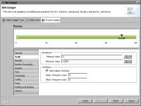
Maximum Value | All | Sets the highest value of the scale |
Minimum Value | All | Sets the lowest value of the scale |
Minor Tickmarks Count | All but sparkline | Specifies the number of minor tick marks to display between major tick marks |
Property | Gadget | Usage |
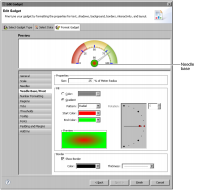
Base Width | Meter | Sets the size of the bottom part of the needle, as a percent of the size of the gadget. |
Border Color | Linear gauge, meter | Sets the border color of the needle. |
Border Width | Linear gauge, meter | Sets the thickness of the needle border. |
Fill Background Color | Meter | Sets the background color of needle. |
Fill Color | Linear gauge | Sets the interior color of the needle. |
Rear Extension | Meter | Sets the size of the portion of the needle behind the pivot as a percent of the size of the gadget. |
Shape | Linear gauge | Sets the shape of the needle. |
Show Value | Meter | Enables or disables the display of the value to which the needle points. |
Size | Linear gauge, meter | Sets the size in pixels, or in percent of gadget width, of the needle. |
Tooltip | Linear gauge, meter | Specifies text for the tooltip. |
Top Width | Meter | Sets the size of the tip of the needle as a percent of the size of the gadget. |
Value | Linear gauge, meter | Sets which needle to format. Several needles can co-exist, based on the data used to create the gadget. |
Value Textbox X Co-ordinate | Meter | Sets the x coordinate of the value text, as a percent of gadget width. |
Value Textbox Y Co-ordinate | Meter | Sets the y coordinate of the value text, as a percent of gadget height. |
Property | Usage |
Border Color | Sets the border color of the needle base. |
Border Thickness | Sets the width of the needle base border. |
End Color | Sets the ending color to use in a fill gradient. |
Fill Color | Sets the interior color of the needle base to a solid color. |
Fill Gradient | Sets the interior color of the needle base to a color gradient. |
Pattern | Specifies the pattern of the fill gradient. Choose Radial or Linear. |
Rotation | Sets the angle of a linear fill gradient. |
Show Border | Displays or hides the border around the needle base. |
Size | Sets the size of the needle base as a percent of the meter radius. |
Start Color | Sets the starting color to use in a fill gradient. |
Property | Usage |
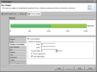
Auto Abbreviation | Abbreviates a number to an appropriate number factor. For example, 10,000 becomes 10K. |
Force Trailing Zeros | Enables or disables the display of trailing zeros after the decimal point. |
Format Numbers | Enables and disables number formatting. |
Fraction Digits | Specifies the number of digits displayed after the decimal point. |
Prefix | Specifies a text value to display before a number. |
Suffix | Specifies a text value to display after a number. |
Property | Gadget | Usage |
Color | Linear gauge, meter, bullet | Specifies the color of the region. |
End Value | Linear gauge, meter, bullet | Specifies where the region ends. |
Label | Linear gauge, meter, bullet | Specifies the name of the region. |
Region | Linear gauge, meter, bullet | Chooses the region for which the settings apply. You can also add or remove a region from the list. |
Show Labels | Linear gauge | Display or hide the region labels. |
Start Value | Linear gauge, meter, bullet | Specifies where the region starts. |
Property | Gadget | Usage |
Major Tick Marks Color | Linear gauge, meter, bullet, cylinder, thermometer | Sets the color of major tick marks. |
Major Tick Marks Height | Linear gauge, meter, bullet, cylinder, thermometer | Sets the height of major tick marks. |
Major Tick Marks Width | Linear gauge, meter, bullet, cylinder, thermometer | Sets the width of major tick marks. |
Maximum Label | Linear gauge, meter, bullet, cylinder, thermometer | Sets the highest tick mark value. Text replaces the numeric value. |
Minimum Label | Linear gauge, meter, bullet, cylinder, thermometer | Sets the lowest tick mark value. Text replaces the numeric value. |
Minor Tick Marks Color | Linear gauge, meter, bullet, cylinder, thermometer | Sets the color of minor tick marks. |
Minor Tick Marks Height | Linear gauge, meter, bullet, cylinder, thermometer | Sets the height of minor tick marks. |
Minor Tick Marks Width | Linear gauge, meter, bullet, cylinder, thermometer | Sets the width of minor tick marks. |
Position Above | Linear gauge, bullet | Sets tick marks to appear above the gadget. |
Position Below | Linear gauge, bullet | Sets tick marks to appear below the gadget. |
Position Left | Cylinder, thermometer | Positions tick marks on the left side of the gadget. |
Position Right | Cylinder, thermometer | Positions tick marks on the right side of the gadget. |
Show Limits Value | Linear gauge, meter, bullet, cylinder, thermometer | Enables or disables the display of the first and last values. |
Show Tick Marks | Linear gauge, meter, bullet, cylinder, thermometer | Enables or disables the display of tick marks on the gadget. |
Show Tick Values | Linear gauge, meter, bullet, cylinder, thermometer | Enables or disables the display of values on tick marks. |
Ticks Inside | Linear gauge, meter | Sets tick marks to appear inside or outside of the gadget. |
Values Inside | Linear gauge, meter | Sets tick mark values to appear inside or outside of the gadget. |
Property | Gadget | Usage |
Arc Inner Radius | Meter | Specifies the inner radius of arc for the threshold area |
Arc Outer Radius | Meter | Specifies the outer radius of arc for the threshold area |
Border Color | Linear gauge, meter | Sets the border color of the threshold marker |
Color | Linear gauge, meter, sparkline, bullet | Sets the color of the threshold area on the gadget |
End Value | Linear gauge, meter, sparkline | Sets the end value of the threshold zone |
Label | Linear gauge, meter | Specifies the text to apply to the threshold |
Length | Bullet | Specifies the length of the threshold as a percent of gadget size |
Line Style | Linear gauge, meter, sparkline | Sets the line style of the threshold |
Marker Color | Linear gauge, meter | Sets the color of the threshold marker |
Radius | Linear gauge | Sets the size of the threshold marker |
Show as Zone | Sparkline | Enables or disables display of the threshold as a zone |
Show Border | Meter | Enables or disables display of a border around the threshold |
Show Marker | Linear gauge, meter | Enables or disables display of the marker on the threshold |
Show Threshold | Sparkline, bullet | Enables or disables display of the threshold |
Show Label | Meter | Enables or disables display of the threshold value |
Show Label Inside | Meter | Displays value inside or outside of the arc on the gadget |
Show Label on Top | Linear gauge | Enables or disables display of the threshold value |
Size | Meter | Sets the size of the threshold marker |
Start Value | Linear gauge, meter, sparkline | Sets start value of the threshold zone |
Threshold | Linear gauge, meter | Sets which threshold the settings affect |
Threshold Line/Threshold Zone | Linear gauge, meter | Sets whether the threshold is a single line or a zone |
Tooltip | Linear gauge, meter | Sets tooltip text for the marker on the threshold |
Width | Sparkline, bullet | Sets the width of the threshold |
Setting | Usage |
Shape | Sets the shape of the anchors. |
Size | Sets the size of the anchor in pixels. |
Visibilities | Sets the visibility and color of the anchors. Open, Close, High, and Low anchors are visible by default. To display anchors for all the other values, select Other Anchors. |
Property | Gadget | Usage |
Border | Bullet | Enables or disables the border around the gadget. |
Border Color | Bullet | Sets the color of the border around the gadget. |
Border Width | Bullet | Sets the thickness of the border around the gadget. |
Line Color | Sparkline | Sets the color of the plot line. |
Line Width | Sparkline | Sets the thickness of the plot line. |
Period Bars Color | Sparkline | Sets the color of the period bars. The color is applied to alternate bars. |
Period Bars Length | Sparkline | Sets the number of values that each period bar highlights. |
Show as Dot | Bullet | Enables or disables the display of the value indicator as a dot instead of a solid line. |
Show Close Value | Sparkline | Enables and disables the display of the close value. |
Show High and Low Values | Sparkline | Enables and disables the display of the high and low values. |
Show Open Value | Sparkline | Enables and disables the display of the open value. |
Show Period Bars | Sparkline | Enables and disables the display of period bars. |
Show Shadow | Bullet | Enables or disables the appearance of a shadow below the gadget. |
Show Value Label | Bullet | Enables or disables the display of the value on the gadget. |
Property | Gadget | Usage |
Border Color | Bullet | Sets the color of the border |
Border Width | Bullet | Sets the thickness of the border |
Color | Bullet | Sets the color of the value indicator |
Show Border | Bullet | Enables or disables a border around the value indicator |
Width | Bullet | Sets the value indicator width as a percent of the plot thickness |
Property | Usage |
Show Tooltip | Enables and disables the display of a tooltip |
Background | Sets the background color for the tooltip |
Border | Sets the border color for the tooltip |
Property | Usage |
Font | Specifies the name of the font |
Size | Specifies the font size in points |
Color | Specifies the color of the text |
Property | Gadget | Usage |
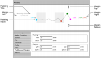
Padding Title | All | Adds space, in pixels, between the title and the element next to it |
Padding Value | All | Adds space, in pixels, between the data value and the element next to it |
Margins Left, Right, Top, Bottom | All | Adds space, in pixels, around the entire gadget on the left, right, top, and bottom sides |
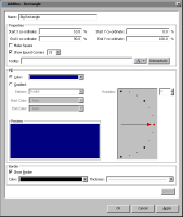
Property | Object Type | Usage |
Center X coordinate | Polygon, Circle, Arc | Specifies the location, as a percentage of the size of the gadget, of the x coordinate of the object. |
Center Y coordinate | Polygon, Circle, Arc | Specifies the location, as a percentage of the size of the gadget, of the y coordinate of the object. |
Color | Line, Text | Specifies the color of the line. |
Dash Gap | Line | Specifies the length of gaps between dashes, in pixels. |
Dash Length | Line | Specifies the length of dashes, in pixels. |
End Angle | Circle, Arc | Specifies the end angle of the object. |
End Color | Rectangle, Polygon, Circle, Arc | Specifies the end color of the gradient fill. |
End X coordinate | Rectangle, Line | Specifies the location, as a percentage of the size of the gadget, of the end x value of the object. |
End Y coordinate | Rectangle, Line | Specifies the location, as a percentage of the size of the gadget, of the end y value of the object. |
Fill Color | Rectangle, Polygon, Circle, Arc | Select to use a solid fill color for the object. Select a color from the associated drop-down list box. |
Font | Text | Specifies the font for the object. You can also select Bold, Italic, or Underline. |
Font Size | Text | Specifies the font size in points. |
Horizontal | Text | Supports the selection of horizontal text alignment in the gadget. |
Inner Radius | Arc | Specifies the radius of the inner portion of the object, as a percent of the size of the gadget. |
Gradient | Rectangle, Polygon, Circle, Arc | Select to have a gradient type of fill. Choose a Radial or Linear pattern. |
Label | Text | Specifies the text that appears on the object. |
Name | All | Specifies the name of the object. This name appears in the list on AddOns options. |
Outer Radius | Arc | Specifies the radius of the outer portion of the object, as a percent of the size of the gadget. |
Radius | Circle | Specifies the radius, as a percent of the gadget, of the object. |
Rotation | Rectangle, Polygon, Circle, Arc | Specifies the rotation angle for the fill in the object. |
Rotation Angle | Polygon | Specifies the rotation angle of the object. |
Scale Image | Image | Enables or disables image scaling. Adjust the height and width of the image by percent. |
Show as Dashed | Line | Enables or disables dashed lines. |
Show Border | Rectangle, Polygon, Circle, Arc | Enables or disables the drawing of a border line around the object. Select the color and thickness of the border with the Color and Thickness drop‑down menus. |
Show Round Corners | Rectangle | Enables or disables rounded corners. Type the percent of a circle to round the corner. |
Sides | Polygon | Specifies the number of sides on the object. |
Size | Polygon | Specifies the size, as a percent of the gadget, of the object. |
Start Angle | Circle, Arc | Specifies the beginning angle of the object. |
Start Color | Rectangle, Polygon, Circle, Arc | Specifies the start color of the gradient fill. |
Start X coordinate | Rectangle, Line, Text, Image | Specifies the location, as a percentage of the size of the gadget, of the beginning x value of the object. |
Start Y coordinate | Rectangle, Line, Text, Image | Specifies the location, as a percentage of the size of the gadget, of the beginning y value of the object. |
TextBox Background Color | Text | Specifies the background color of the text box. |
TextBox Border Color | Text | Sets the border color of the text box. |
Text Wrap | Text | Disables or enables text wrap. Choose, by percent of the gadget, the maximum height and width for the wrap. |
Thickness | Line | Specifies the thickness of the line. |
Tooltip | All | Specifies text for the tooltip. |
Transparent | Image | Specifies the amount of transparency, in percent, of the image. |
URL | Image | Specifies the location of the image for AddOn file types of .gif, .jpg, .png, or .swf. |
Vertical | Text | Supports the selection of vertical text alignment in the gadget. |