Grouping optional Y value data
You group Y values for different reasons, depending on the chart type, as described in
Table 12‑3.
Table 12‑3 Using optional Y grouping for different chart types
Chart type | Reason for using optional Y grouping |
Bar, cone, line, pyramid, tube | To summarize data into multiple sets of risers in the chart |
Area, difference | To summarize data into multiple areas in the chart |
Bubble | To identify bubbles using the legend |
Meter | To plot multiple meters |
Alternate meter subtype | To plot multiple dials |
Pie | To plot multiple pies |
Scatter | To plot multiple (x-y) value pairs |
Stock | To plot multiple sets of candlesticks |
To group y-axis values, you use Optional Y Grouping in the Select Data page of the chart builder.
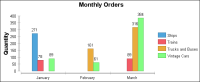
Grouping Y values in a bar chart
The chart shown in
Figure 12‑14 groups Y values to plot multiple sets of bars representing the monthly sum of orders for three types of vehicles.
Figure 12‑14 Bar chart that plots multiple sets of bars by grouping
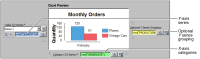
Figure 12‑15 shows the axes and grouping definitions used to create this chart.
Figure 12‑15 Axes and grouping definitions for plotting multiple sets of bars
Build the expressions shown in
Table 12‑4 by dragging columns from the data preview and dropping them in the three areas shown in
Figure 12‑15.
Table 12‑4 Definitions of series in bar chart that uses grouping
Series | Expression |
Value (Y) Series | row["QUANTITYORDERED"] |
Category (X) Series | row["ORDERDATE"] |
Optional Y Series Grouping | row["PRODUCTLINE"] |
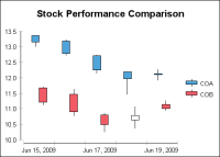
Grouping multiple y-axis values in a stock chart
In a stock chart, four different value series expressions provide the high, low, open, and close data. The category series expression arranges the values along the
x-axis, typically along a date or time scale. To set up multiple sets of candlesticks, you can either define multiple value series definitions or use optional grouping. For example, the stock chart in
Figure 12‑16 presents stock data for two companies.
Figure 12‑16 Stock chart that uses grouping
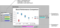
Figure 12‑17 shows the expressions used to create the chart. The chart uses the Y value expressions to set up the candlesticks and the category X expression to arrange the candlesticks in chronological order along the
x‑axis. The expression, row["Symbol"], which you drag and drop in Optional Y Series Grouping, creates one set of candlesticks for each ticker symbol.
Figure 12‑17 Data expressions for the stock chart
The data for the chart is shown in
Table 12‑5.
Table 12‑5 Data for a stock chart that uses grouping
Symbol | Date | Open | High | Low | Close |
COA | 6/15/2009 | 13.36 | 13.36 | 13.01 | 13.15 |
COB | 6/15/2009 | 11.67 | 11.70 | 11.12 | 11.21 |
COA | 6/16/2009 | 13.18 | 13.23 | 12.72 | 12.78 |
COB | 6/16/2009 | 11.46 | 11.62 | 10.77 | 10.90 |
COA | 6/17/2009 | 12.71 | 12.73 | 12.14 | 12.25 |
COB | 6/17/2009 | 10.80 | 10.85 | 10.25 | 10.49 |
COA | 6/18/2009 | 12.19 | 12.19 | 11.46 | 11.97 |
COB | 6/18/2009 | 10.63 | 11.06 | 10.37 | 10.78 |
COA | 6/19/2009 | 12.13 | 12.27 | 11.93 | 12.10 |
COB | 6/19/2009 | 11.14 | 11.25 | 10.94 | 11.00 |
You can also use multiple sets of value series expressions to create multiple sets of candlesticks. For example, you can create the same chart using joined data.
Table 12‑6 contains the data for company COA stocks.
Table 12‑6 Data for a stock chart using two sets of value series expressions
Date | COAOpen | COAHigh | COALow | COAClose |
6/15/2009 | 13.36 | 13.36 | 13.01 | 13.15 |
6/16/2009 | 13.18 | 13.23 | 12.72 | 12.78 |
6/17/2009 | 12.71 | 12.73 | 12.14 | 12.25 |
6/18/2009 | 12.19 | 12.19 | 11.46 | 11.97 |
6/19/2009 | 12.13 | 12.27 | 11.93 | 12.10 |
Table 12‑7 contains the data for company COB stocks used by the same chart.
Table 12‑7 Data for the second series for a stock chart using two sets of value series expressions
Date | COBOpen | COBHigh | COBLow | COBClose |
6/15/2009 | 11.67 | 11.70 | 11.12 | 11.21 |
6/16/2009 | 11.46 | 11.62 | 10.77 | 10.90 |
6/17/2009 | 10.80 | 10.85 | 10.25 | 10.49 |
6/18/2009 | 10.63 | 11.06 | 10.37 | 10.78 |
6/19/2009 | 11.14 | 11.25 | 10.94 | 11.00 |
To define multiple sets of candlesticks, you use the value series drop-down list. Select New Series, shown in
Figure 12‑18, and then either drag and drop columns from Chart Preview to the expression fields, or type code to create the series expressions. After you add one or more sets of expressions, you can use the drop-down list to navigate among them.
Figure 12‑18 Adding a stock chart value series
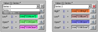
To create multiple sets of candlesticks, you use the following expressions to define the category and value series in the stock chart:

The Category Series Definition is row[
"Date
"].
The first set of value series expressions uses row[
"COAHigh
"], row[
"COALow
"], row[
"COAOpen
"], and row[
"COAClose
"].
The second set of value series expressions uses row[
"COBHigh
"], row[
"COBLow
"], row[
"COBOpen
"], and row[
"COBClose
"].